How To Create Killer CTAs Using A/B Testing

Understanding how to tweak buttons in order to make them more attractive in the eyes of the reader is often a challenging task.
This being said, there is an important tool that is not always used properly to determine our target group’s behavior: the A/B test.

From developing integrations to strategic support, from creating creative concepts to optimizing results.
Running an A/B test means submitting two or more different versions of the same message to a sample of our target audience and analyzing the reaction to a change in the variables (email subject, images, call-to-action, etc.).
Now let’s find out how to run an A/B test on the CTA.
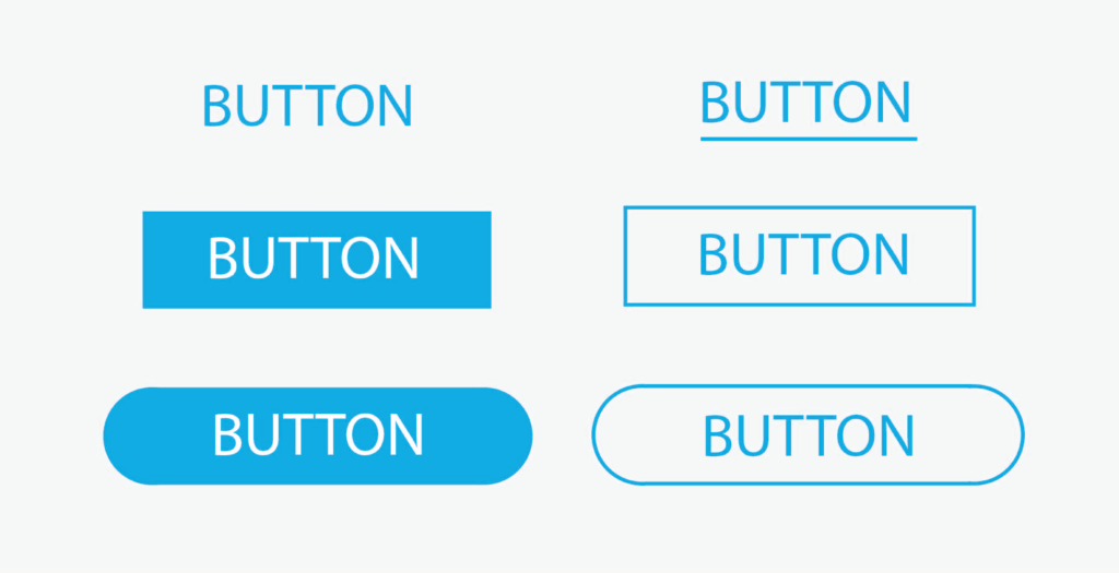
Call-to-action: which variables to test
There are many variables we can test our readers with when it comes to a CTA. Let’s explore the most significant.
1. Color
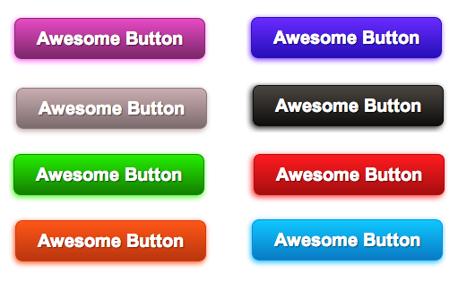
We know that colors have the power to subconsciously influence human behavior: this can be cleverly exploited in our communications. Commonly, warm colors (yellow, orange) generate optimism, cold colors (blue) serenity and confidence, green relaxation and freshness. Get creative and try different colors for your CTA to figure out which one works better for your goal.
Using colors that contrast with the email color can be a solution to make the action stand out. But be careful not to overdo it: a poor choice of color palettes can ruin the entire communication and lose clicks instead of attracting them.
Also keep in mind that it is always a good idea, in your email, not to wander too far from your corporate palette.
2. Size
The button size can make all the difference when it comes to a CTA. The button should be large enough to be noticeable, but an excessive size may be too aggressive and detrimental to the user experience. Testing different sizes will give you an idea of the impact on readers.
The rendering on mobile devices is also a key element to consider when choosing the button size. So make sure it is well balanced throughout the design and convenient to click on even on smaller screens.
3. Position
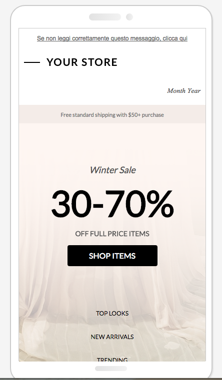
It’s always advisable to place the button where it is visible on the first scroll, though some types of email convert better if the CTA is preceded by an explanation of the content.
An alternative is to include two CTAs, one above and another below the first scroll. Or you could play with different alignments: left, right or center.
4. Wording
The text should clearly communicate what will happen once you click. The trick is finding creative solutions while always ensuring the clarity of the message.
One example is the classic Buy now. While it is clear and concise, this CTA might make less accustomed readers worry that by clicking they are somehow bound to make a purchase. In this case we recommend that you test softer solutions like Add to cart or Continue shopping .
Another variation to play with is voice. For example it might be interesting to test the results of an imperative, like Click here, rather than the first person singular, I’m clicking.
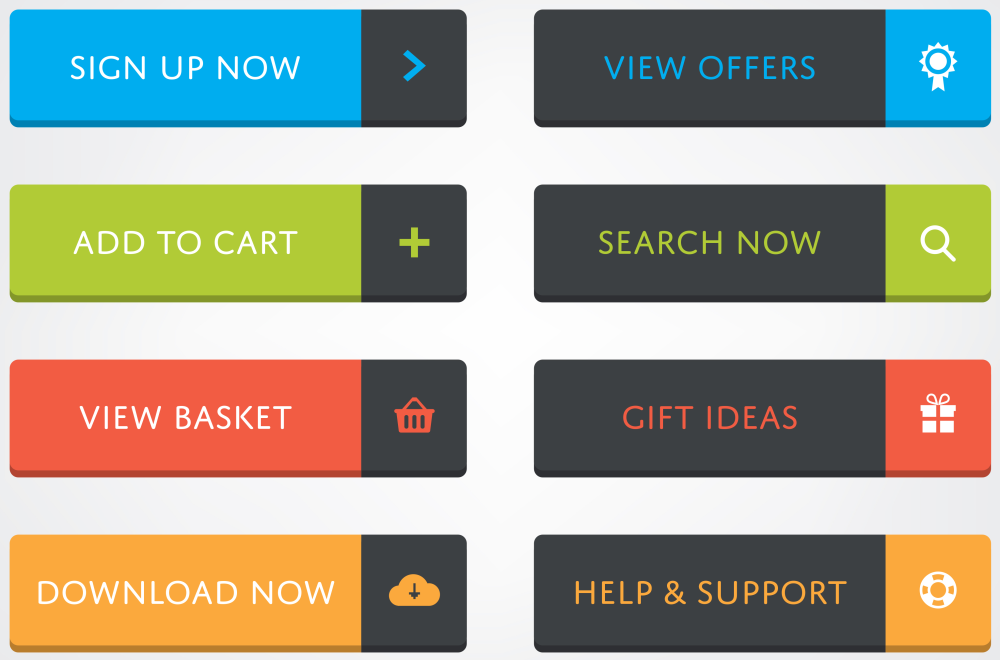
You can also vary the length of the text and measure its impact. Bearing in mind best practices that use a maximum of 3-5 words, you can test by trying to add or remove words: even changing one word can make a difference!
5. Special effects
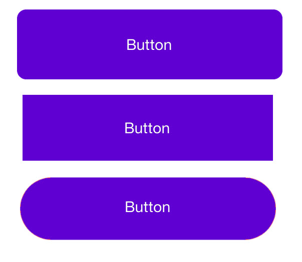
Buttons can be highlighted using special shapes that deviate from the standard. Why not try adding some “special effects” to experiment with the interactivity?
Some variables may include:
- Roundness or angularity of the button corners
- Adding a 3D effect
- Adding shadow
A/B testing with MailUp
Now that we’ve outlined some of the theoretical content, we can move on to practice by creating an A/B test on the MailUp platform (don’t have one? Sign up for free and get going!). For the test to be reliable, it must be applied to a statistically significant sample. For this result, we usually recommend selecting no less than 6,000 recipients.
Step 1: Create the emails
Start from an email saved in the Messages menu.
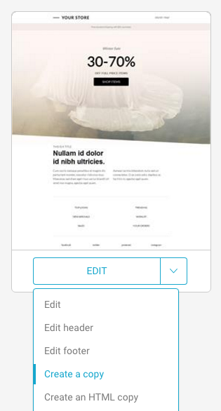
Now create a copy (or copies) of the original email in which to work with the variable. To do this, select the original message from Messages > Email, then click Create a copy from the Edit menu.
Step 2: Create the control and test versions
Work out the variants for your message, focusing where possible on a single feature (e.g., color, size, text – herebelow is color) so that the results are clear to read.


Step 3: Set the A/B test
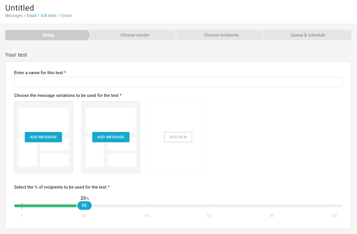
To set up the experiment, click Messages > Email > A/B tests > New A/B test, and pick the messages that you’d like to test. Important: select Best click-through rate as the test metric.
Then choose the number of hours after which the best-performing email will be sent to the remaining recipients. Save & continue, then select the recipients to set up the sending.
Step 4: Check the result of the A/B test
After the experiment, you can check its performance clicking on Combined statistics. Remember that the parameter to look for in the case of the A/B test on the CTA is the click-through rate. You can also easily share your report with your colleagues by clicking on To share this report.
Wrap up: 3 A/B testing best practices
1. Test only one item at a time
For the test to be easy to interpret, it is important that it provides a single variable. For example, if you need to assess the impact of a call-to-action, all the other elements of the message (subject, images, alignments, etc.) must remain unchanged.
2. Be consistent with the conditions for sending
How much time must elapse after the A/B test before actually sending the winning message? If you run the A/B test in the morning, it would be ideal to send the winning message also in the morning. Changing the timing conditions could affect performance.
3. Randomly choose the group to be subjected to the A/B test
To achieve credible and meaningful results, you must test two or more comparable and thus random segments. With MailUp, you do not need to create the groups manually, as the platform randomly segments the two (or more) test groups.
