The complete email design checklist, from design to delivery
The design of a message is your branded business card for the recipient. It impacts all on-mail metrics.
As a matter of fact, design means performance in Email Marketing. The ability to untangle the complex universe of email design, including fonts, images, GIFs, and calls to action is vital if you want to stand out in the inbox and encourage openings, clicks, and conversions.
We’ve identified key best practices and common email design pitfalls, condensing them into this mini guide. We aim to navigate you through every step of the process, from design to delivery.
From developing integrations to strategic support, from creating creative concepts to optimizing results.
1. Structure
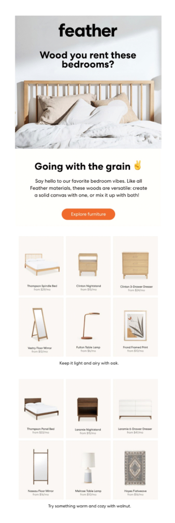
The structure of a message is the arrangement of its elements base on a precise order. Define the structure by selecting the key elements you want to use (texts, images, CTA buttons, etc.), and arrange them in an organized way within a template.
✔️ Best practice
Follow a hierarchical order when inserting every element
⚠️ Don’t trip up on this
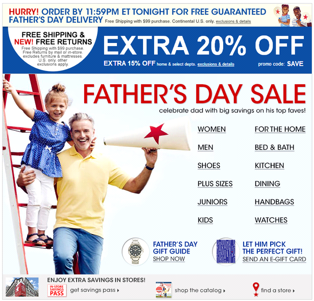
Avoid disordered and too complex structures
2. Color
This element alone may be the basis of 90% of first impressions we have about a particular product (Source: Helpscout).
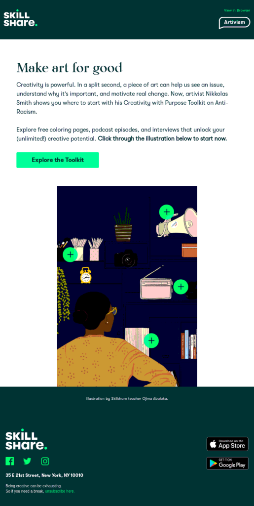
Colors highlight the key elements of the message within an email and guide the user’s eye toward the action to be taken. Define a simple and logical palette of shades and associate each color with a specific use.
✔️ Best practice
A balanced use of color will draw attention to specific message elements, so limit the palette to two or three shades.
⚠️ Don’t trip up on this
Try not to associate different functions to the same color (buttons vs. plain text, for example)
3. Images and GIFs
Emails containing images have higher open rates and responsiveness than text-only messages, which can often feel cold and impersonal. Furthermore, the use of GIFs can increase clicks up to 42% (Source: MarketingSherpa).
✔️ Best practice
Keep a maximum weight of around 50 KB for images and 100 KB for GIFs to avoid long loading times that would discourage the user from taking action. Further, an excessive email weight would compromise the deliverability of the message.
⚠️ Don’t trip up on this
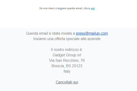
Skip images and GIFs with alt text. This would be the result:
4. Call to action
The call to action is an explicit invitation to take an action and finalize the conversion. This is why it’s important to take care of every detail of the CTA button, such as copy and positioning, and to keep A/B testing to understand which type of text, shape, and color are most effective.
Find out how the A/B test works!
✔️ Best practice
Make sure the CTA button is bulletproof, meaning it’s written in HTML to correctly display in any inbox.
⚠️ Don’t trip up on this
Remember to include CTA buttons. Otherwise, the user wouldn’t know if and where to click.

5. Footer
The footer is the space meant for information related to the recognition, reliability, and reputation. So don’t overlook this element. Otherwise, you risk compromising the relationship of loyalty between the company and the recipient.
✔️ Best practice
Enter all the trust-linked information in the footer: social media buttons, permission reminders, unsubscribe links, copyright details, contact information, and the privacy policy.
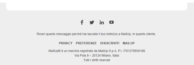
Anatomy of a complete footer
⚠️ Don’t trip up on this
Remember that entering information with no hierarchy, no ordered structure, or exceeded quantity would hinder the footer’s purpose of transparency and clarity.
6. Responsiveness
Mobile-optimized emails ensure greater accessibility and higher click-through rates. When it comes to choosing a campaign template, a responsive design is the best solution to ensure a high level of content usability, plus greater text and CTA readability.
✔️ Best practice
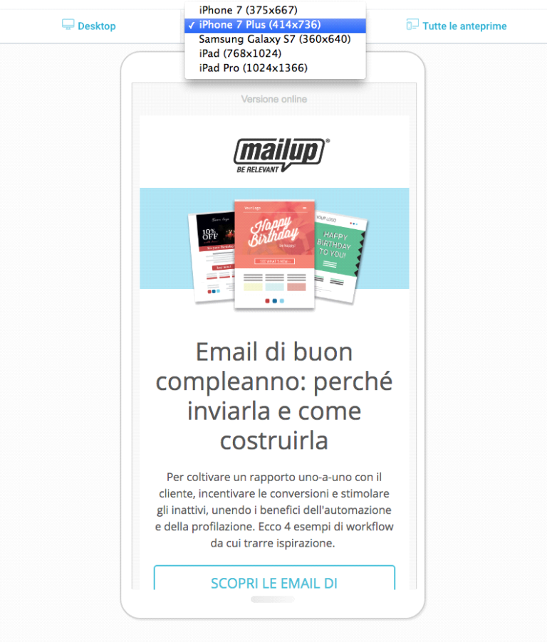
Insert the most important elements of the message (i.e. texts and CTAs) on the page, not in the images. This way, they can resize and readjust to mobile. Also, check the rendering of the message on desktop and mobile clients.
Capitalize on the MailUp Message preview function. Create your email with the BEE drag & drop and mobile responsive editor, then easily and quickly simulate how your design looks on most of the mobile clients on the market.
⚠️ Don’t trip up on this
Rule out special or proprietary fonts. These may create display problems on some email clients. Also, avoid fonts that are too small, i.e., less than 22 px for titles and 16 px for text.
7. Link and UTM
Links bridge the email and the landing page where the user can finalize the action. Therefore, it’s key to check that they are correct and reliable. Track their effectiveness through the UTM (Urchin Tracking Module).
✔️ Best practice
Verify that each link inserted is reachable and correct. Check for any blacklisting. For an effective traffic source tracking, you should insert at least these three parameters in the UTM code string: source, medium, and campaign.
A few single clicks will let you check the correctness and reliability of the links inserted before sending them. Just go on the MailUp Message summary page and use the Check-up message function. Refer to the MailUp manual to find out more!
⚠️ Don’t trip up on this
Using spaces in the UTM parameters and not being specific when filling out the fields would make the origin of the traffic unclear. This would then jeopardize the usefulness of the parameters.
8. Subject and pre-header
Strictly speaking, although it doesn’t belong to the Email Design, the subject is the first element of the message that the user sees. It determines its opening in 35% of cases.
The complementary element to the subject is the preheader, a.k.a. summary. It’s a good practice to fill out this extra space to communicate additional information and encourage user opening.
✔️ Best practice
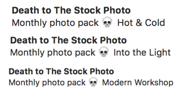
Be clear and specific in filling out the subject, anticipating the key concept of the message. Increase the effectiveness of this element by using dynamic fields and emojis.
⚠️ Don’t trip up on this
Placing too much emphasis on the convenience and advantage of the email and using a tone of exaggerated enthusiasm may give the subject a spammy veneer that discourages openings.
In summary
If your emails often go unnoticed and struggle to stand out in the inbox, then this guide is for you! Follow all tips and best practices, and don’t forget to carry out continuous tests to understand what’s effective for your recipients.