7 Email Design Trends Popular This Fall
Companies consider September a new beginning, with renewedobjectives and new intentions to be pursued from now until the end of the year.
While not offering huge margins for radical strategy changes, September is certainly a good opportunity to review some aspects which only appear to be superficial: email design, for example.
This is exactly what we would like to discuss today, suggesting some of the more in vogue trends of the most respected marketers. There are seven graphic trends with which you can align your email marketing campaigns.
From developing integrations to strategic support, from creating creative concepts to optimizing results.
1. CSS animation: an incentive to click
Generally,CSS animations are applied to callto action buttons and images.
The mainobjective is to emphasize the potentialaction triggered by the recipient’s click on the highlighted item. To makethe concept even clearer, here’s an example of CSS animation applied to anemail button and image:
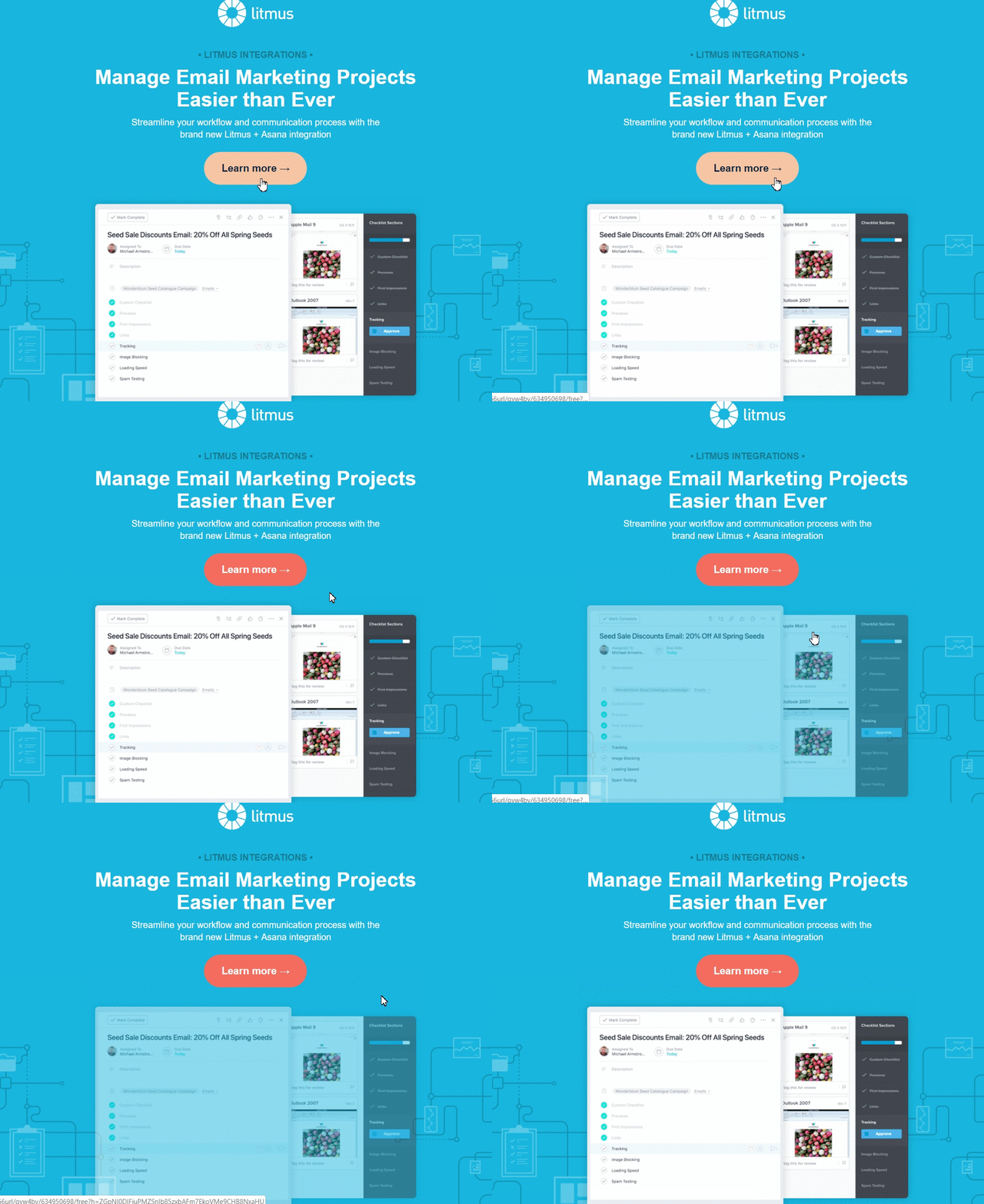
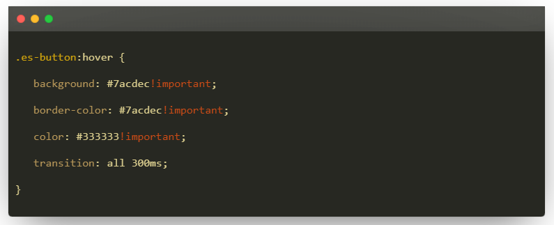
All you needto set up CSS animation is a few simple operations in the HTML code of the email. Here is the code needed:
2. The minimal-animated layout
A minimalstyle is always effective: it offersclear, clean solutions that make an impact, despite the bare layout.Minimalism makes it possible to enhance the key elements of an email: the copyand the images of products or services.
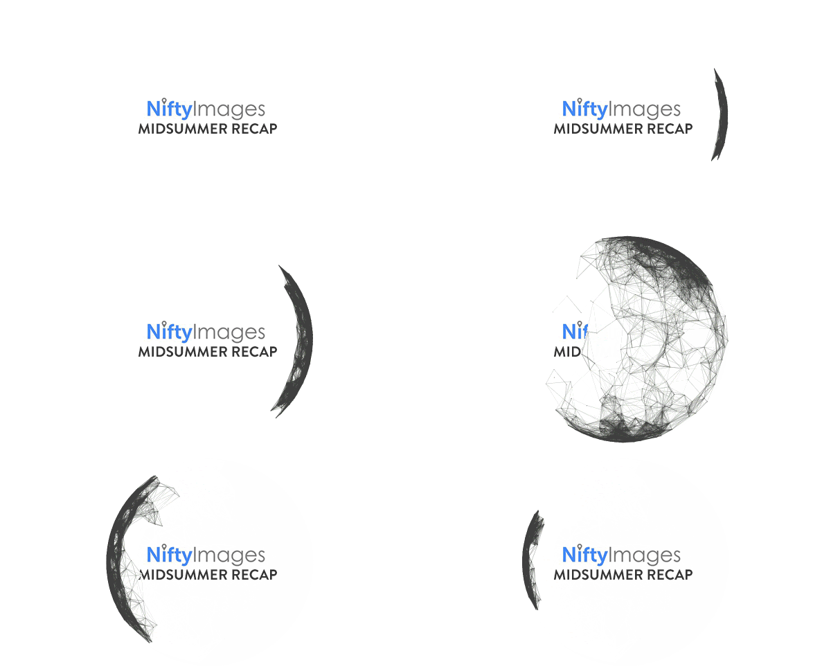
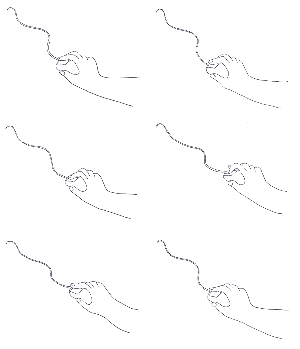
But a recenttrend has led some companies to create emails that combine conciseness with animation.The result is brilliant, as in this email from NiftyImages which uses whitespaces and reduces the number of colors in the palette to a minimum whileleaving room for movement and dynamism in the illustrations.
3. Accessibility
Accessibilitymeans designing emails that guarantee all recipients – including recipientswith disabilities (for example,blindness) or recipients who use assistive technologies (such as screen readers) – the full use ofmessage content.
Designersand marketers are becoming increasinglyaware of the issue of accessibility, so much so that they want to transform techniques and bestpractices in email marketing as well.
Here are afew requirements for ensuring good accessibility to emails:
- Pay attention to the color contrast. A great tool for testing email contrast is WebAIM
- Keep the characters legible. Never go below 14px for normal characters and 16px for lighter ones
- Always underline links
- Avoid light text colors, because they are more difficult to detect, especially on a light background
- Align the text on the left, as it is more readable than when centered
- Keep a logical structure, using a hierarchical modular layout that organizes the main header, the descriptions, the subsections, and the body copy, closing with the footer
- Don’t forget the alt text, which must be descriptive and explain the image
- Always include captions in videos.
4. The “tactile realism” of 3D images
3D has been in vogue in the world of graphic design for several years now,and it’s not surprising that it has also reached email design.
The potential of 3D images lies in their realism, in giving email a greater degree of depth, having a stronger impact on the recipient who sensessomething “graspable”.Here is a great example:
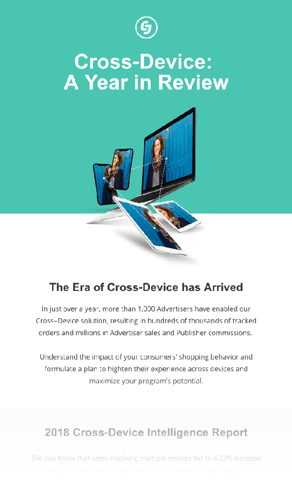
With toolslike Adobe Dimension CC, emaildesigners have the opportunity to experiment with 3D images and enrich thevisual potential of their emails exponentially.
5. Gradient energy
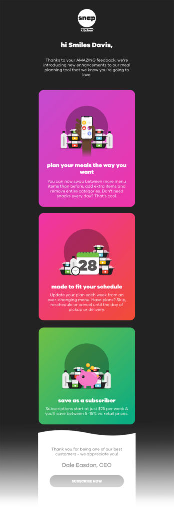
Gradients seem to be seriously back in style. Some people love them and some people hate them. With their bright, slightly fading tones, gradients are captivating and energetic.
Aninteresting fact: according to some people, the origins of the gradient shouldbe traced back to the psychedelia of the 60s. Making it comeback in style would indeed be indeed that dominant feeling of our times: nostalgia.
6. The realistic illustration-image combo
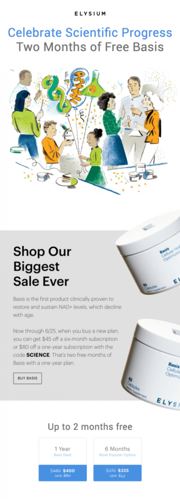
Illustrationsare also quite in vogue at the moment: they are elements that captureattention, urging the observer to linger, as if standing in front of awork of art. Here is a modern and captivating example that stands out in anoverall minimal email.

Anotheremerging trend accompanies the illustrations with realistic, photographic images. This combination has greatpotential: here is an example of a newsletter that combines a pastelillustration in the header with photographic images of the product.
7. The discreet charm of monochrome
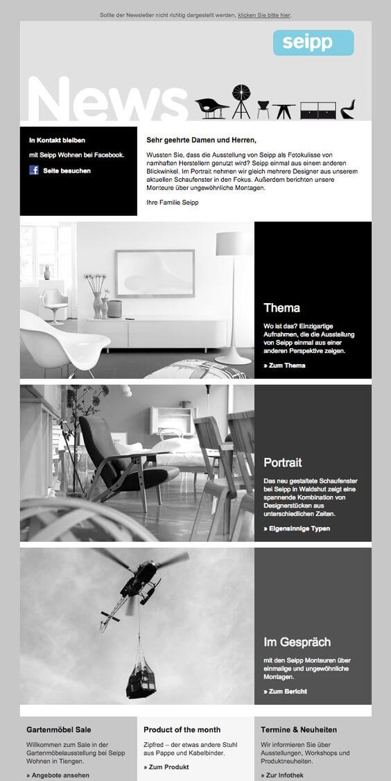
There are peoplewho experiment with color and matching and there are people who, in contrast,prefer a single color: monochrome isdestined to make a bigger and bigger comeback, also in email marketing and webdesign.
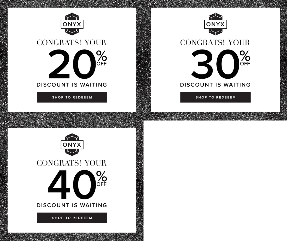
The mostpopular choice today is within the blackand white scale. This color (or rather, non-color) palette createssurprising contrasts and manages to make the best elements and key content ofan email stand out.
Summing up
Email designis always seeking a compromise between personal experimentation of each brand and the ability totake advantage of the most popular current trends.
Our advice is to stay up-to-date always on email design trends with the dedicated section of MailUp Blog: it has examples from real companies, best practices, and real practical guides for email design.
Without forgetting that with the BEE editor, you have the most advanced email creation tool available on the market. If you haven’t tried it yet, you can request a free trial of the MailUp platform in which BEE is integrated and all its features are accessible.
Notes
(1) CSS animations:a web motion design tool that makes CSS3 available. CSS animations let you gradually change the style of an element of a webpage or an email. For each style change, you must specify a keyframe, which determines the type of style to apply to the element at a specific moment in time: in practice, it represents the “code” for executing the animation.Torna su
(2) Accessibility:according to the National Federation of the Blind, in the United States approximately 1.3 million people are blind, and every year 75,000 people become blind or visually impaired and continue to rely on their mobile devices.Torna su
(3) Gradients:their fundamental characteristic is to fill a space with progressive gradations of two saturated colors. A perfect example is the Instagram logo, which goes from midnight blue to an intense yellow. The brand identities of all the main hubs of the tech world, from Airbnb to Spotify, have used gradients at some point in their past.Torna su
