Marketing psychology: improve your email design by exploiting how your customers’ minds work

And the only real secret that needs to be respected is that in addition to being a marketer, you have to be a bit of a psychologist too.
Today we’ll discuss psychology applied to marketing to learn how to exploit the human mind’s common patterns of response to stimuli. Knowing these user behavior patterns, known as cognitive bias, will allow you to guide users to your CTA, increasing your emails’ conversion rates.
Marketing and psychology: the biases that guide your customers’ minds
The human mind has the ability to react to external stimuli in just a few seconds. Here’s the mechanism: the brain filters the information it receives, processes it and assigns meaning to it; then it responds to the stimulus with a behavior that is generally predictable.
In fact, people act on the basis of cognitive biases they use to interpret the information collected. These judgments are not logical and often lead to evaluation errors, but there are just too many stimuli and options available to the brain, so it uses shortcuts, practical solutions to make decisions in little time.
What interests us here is how a predictable behavior can be controlled or guided.
Marketing psychology can be applied to texts, using the persuasion levers of copywriting (theorized by Robert Cialdini), or to design, incorporating the most common cognitive biases in the design of platforms, landing pages or email templates.
The part concerning design is really very interesting in email marketing, because it includes both the arrangement of content (texts, images, videos, …) as well as the choice of layout (single column, multiple or hybrid), reading patterns (Z pattern, F pattern, Gutenberg Diagram, …) and colors (there are very interesting studies on the subject).
The goal of the email design process is to make reading an email a memorable experience. Cognitive biases can help you accomplish this.
The principles underlying how the consumer’s mind acts
All people are unconsciously prone to develop the following behaviors:
- prefer simple and clear information
- look for patterns to classify information
- escape risk
- avoid loss
- stay consistent
- have the approval of peers.
These are the main mental patterns of any user when responding to a stimulus.
Cognitive biases: how they work
Biases act on four levels:
- Information: users filter the messages they receive.
- Sense: users try to make sense of information and make assumptions based on what they know.
- Time: users resort to shortcuts to save time and quickly jump to conclusions.
- Memory: users try to remember what is most important. The human brain assigns a fast track to a certain type of stimulus over others.
Design and psychology: the biases you can immediately exploit in your emails
Let’s take a look at how cognitive biases work in reality and how you can use them to design more effective emails:
- Hick’s Law: the more options you give users, the more likely you are to lose them. Users want to act quickly, and shirk away from long and tedious processes. Put this psychological principle into practice when designing your menus or a form to fill in: they must be agile, short, with an easily skimmed order and familiar elements.
- Confirmation bias: people interpret and remember information by confirming their ideas and beliefs. You can exploit this bias if your brand is associated with quality standards recognized by your target audience. All you have to do is confirm this belief, reinforcing your brand identity as a leader in every email. A practical example? Apple’s communication strategy continually reinforces the idea of being the brand par excellence in the technology sector.

- Priming: the user’s response can be influenced by visual or verbal cues, activating known associations just before introducing another stimulus. A practical example of the use of this bias in email design: travel brands insert images of a dream trip to influence users’ perception and push them to a positive response. Another application is the use of the same color for the offer proposed and your call to action.

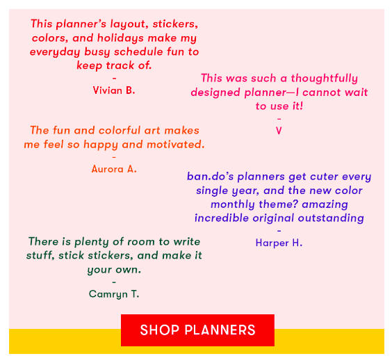
- Social proof: people seek confirmation of their actions in the choices of their peers. This cognitive shortcut can also be used to create a more effective design for your emails: show a badge with the number of people who have already purchased the product you offer, indicate the most popular packages in your offer or add a box with testimonials mentioning their positive experience with your brand.

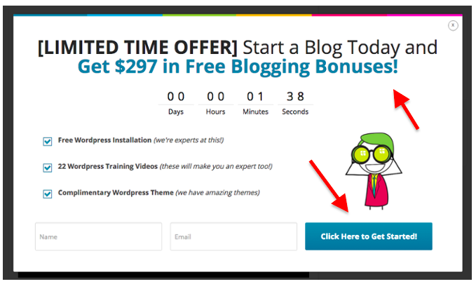
- Scarcity: propose offers limited in time, spots or features. This is a widely used principle of marketing psychology that, on the one hand, appeals to human instinct to avoid loss, and on the other emphasizes the quality of what is being offered. In practice: insert a countdown to the end of the offer in your email, or a text indicating the units still available above a banner that leads to the purchase page of a product.

- Familiarity: your prospects are looking for familiar elements which they have already experienced. This is why it’s important to work on the brand identity and recognition in the communications you send. Include recurring and identifying elements in your email templates, such as the use of your brand colors and images consistent with your style.
- Senses: engaging senses helps create an emotional connection with subscribers in your database. Insert elements that appeal to the five senses – sight, touch, smell, hearing and taste – in your emails using images, gifs and videos that recall the sensory world. Did you know, for example, that 75% of shoppers say they would rather “feel” a product before buying it? There are a thousand ways to do this, try to be creative.
Conclusions
These are just some of the approximately 100 cognitive biases that can influence a user’s decisions when subjected to a stimulus, such as clicking on a link or continuing to read content until the conclusion. I’ve selected the ones that offer practical ideas for improving an email’s design and can help you trigger certain user behavior.
Summing up:
- ordered, schematic and simple emails are more effective than confusing ones which lack a structure and layout that guide users along a path
- emails with a single CTA work best because they don’t force the user to choose between multiple options
- users seek out shortcuts in deciding what to do: offer them.
Take advantage of these programmed behaviors as tips for designing the messages you send to your contact base and avoid those very common missteps that lead the user to unsubscribe from your emails. Test the various approaches and monitor the results to find out which biases work best with your target audience.