Here are the top email design trends of 2021
Catching recipients’ attention in overcrowded inboxes was the hardest test of 2020 for 42% of marketers, and according to 23.7% of companies, design and visual content are one of the biggest challenges.
These two statistics are by no means contradictory: email design is one of the key tools for standing out in inboxes, and focusing on a message’s visual impact is undoubtedly an effective strategy for encouraging openings, clicks, and conversions.
So let’s take stock of the latest email design trends to understand how to keep up with the times and what to expect in inboxes in the coming months!
The three “Es” of email design 2021: essentiality, emotionality, and equilibrium
Essentiality
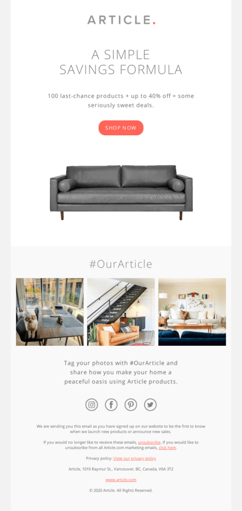
Minimalism is reconfirmed as a leading trend in 2021 email campaigns. An essential style creates less distraction for the reader and gives the message an orderly and clear layout, making the action to be taken and the purpose of the message immediately evident. When choosing this type of style, the biggest challenge is managing to be creative and be recognized in an inbox while still maintaining simplicity.
Thus this year we will continue to see ordered templates, few decorative elements and colors, and a clean, geometric layout.

Equilibrium
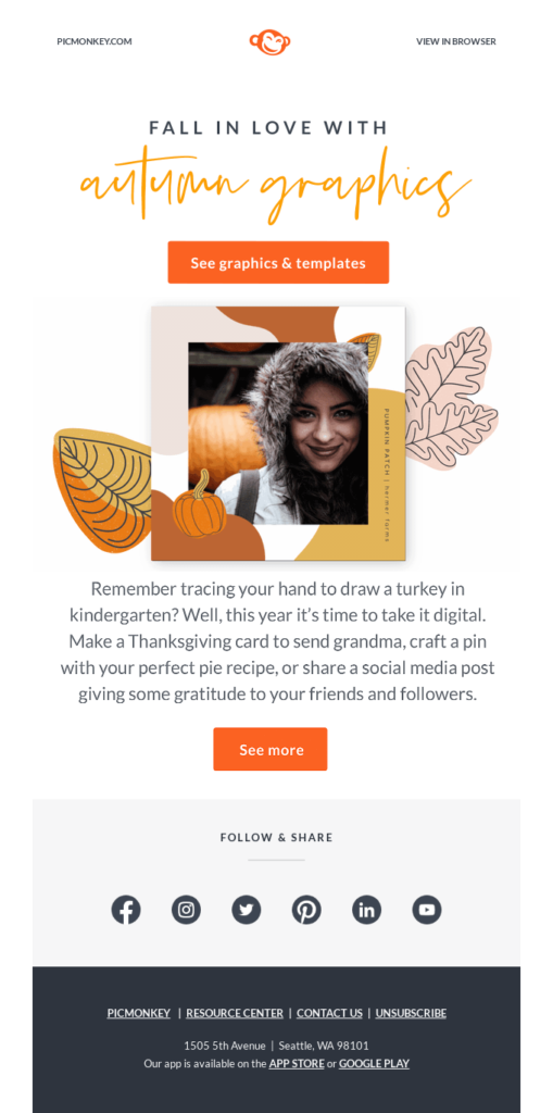
Creativity successfully compromises with the return to minimalism by seeking out a balanced mix of different styles and visual elements. In the 2021 campaigns we will often find photographic images to which graphic details such as lines and shapes are added, playing with originality and avoiding creating messages that are so simple and minimalist that they seem boring, thereby ensuring the right balance between essentiality and originality.
Emotionality
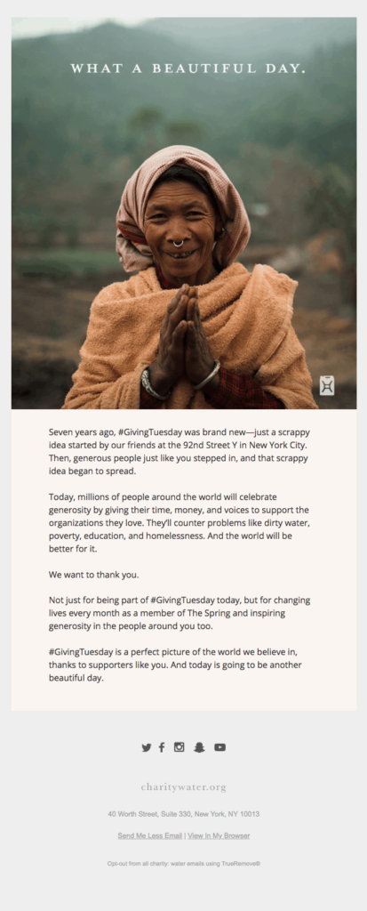
2021 will be the year of emotional design, or of design created not only to stand out in inboxes, but also and above all convey emotions. This trend is undoubtedly affected by the influence of the health emergency: the pandemic has awakened users’ need for empathy, opening up to emotionality not only in terms of the choice of content and tone of voice, but also the design. From the choice of colors to that of titles, passing through the types of images: everything is designed to build a message with a strong emotional impact which affects and impresses the user.
Minimalism and simplicity in color, too
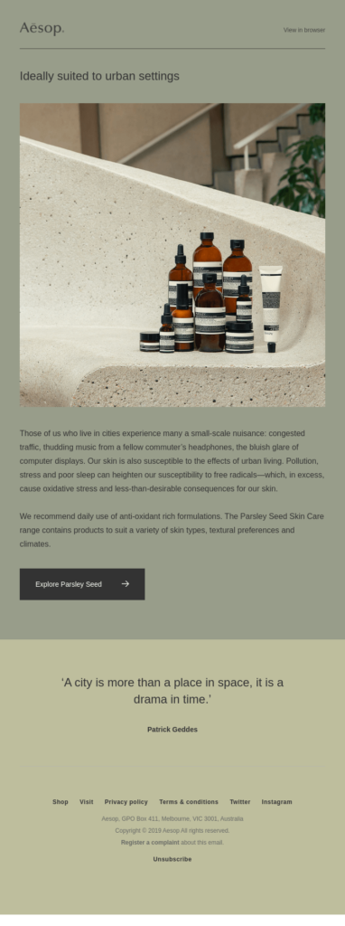
Essentiality is not just limited to style and layout, but also greatly influences the use of color. We will see different trends, including monochromatic palettes, neutral colors, gradient effect, and pastel shades, all related to the same common denominator: minimalism, balance, and soft atmospheres.
Monochromatic palette
One of the best practices in email design is to limit your choice of colors to two or three shades. In 2021 we will see this theoretical rule, i.e., the use of monochromatic palettes connected to a single key color which recalls the brand or the type of product, brought to extremes. From the background to the images, all the message’s elements are conveyed with darker or lighter tones of the same shade, creating a strong visual impact that is still balanced and minimal.

Soft colors and pastel shades
From the point of view of the type of colors, the use of soft, muted, and pastel shades prevails. Strong, bright, and vibrant colors will leave room for desaturated shades that suggest the notion of calm, peace, positivity, and safety.


Gradient effect
The gradient effect is said to have come from the psychedelic culture of the sixties, and its return in email design creates vintage atmospheres and a sense of nostalgia. (Source: Uplers).
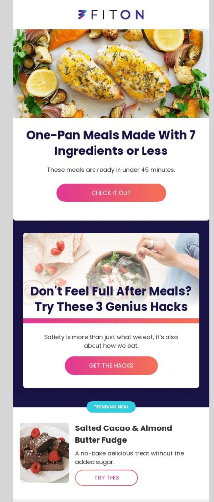
The gradient effect, meaning the gradual shading of colors, is one of the most original and interesting trends of 2021. Like all trends, its use has no limits and can be applied to different elements of the message, especially:
- the background, to create movement and guide the user’s eye from the beginning of the message to the end

Fonts become the protagonist, between bold characters and XXL sizes
When it comes to email design, we often make the mistake of dwelling only on the different uses of colors and images, forgetting that font also plays an important role in creating emails with a strong visual impact.
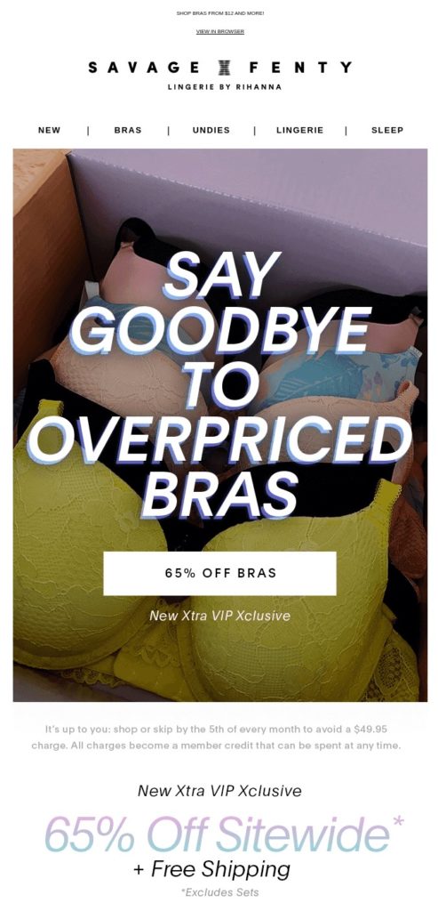
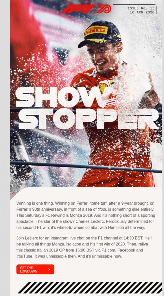
Unlike the style and color trends, the font trend has gone in a completely opposite direction: they are taking on extra large dimensions, strongly dominating the message space and becoming increasingly bolder and over the top.
The success of bold fonts
The use of a bold font immediately gives a title a considerable visual impact and is the best choice when you want to communicate a key concept, an effective slogan, or a particularly important and significant message.
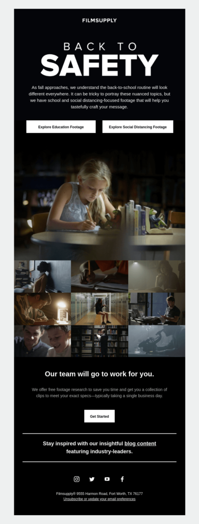
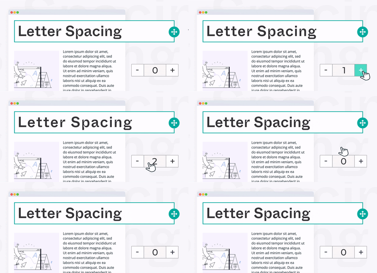
To avoid creating unreadable titles, you can give your bold characters a bit of space by using letter spacing, one of the new features of the BEE drag&drop editor. By increasing the space between the characters, your titles will become clearer and more usable, allowing you to continue using a bold font.
Large titles and messages
In addition to bold fonts, another 2021 trend relates to font sizes, which will be increasingly larger in order to give titles a leading role in the message. Their size has reached deliberately excessive levels, overlapping hero images or in the most extreme cases, replacing them and claiming all the space above the fold to capture the reader’s eye.
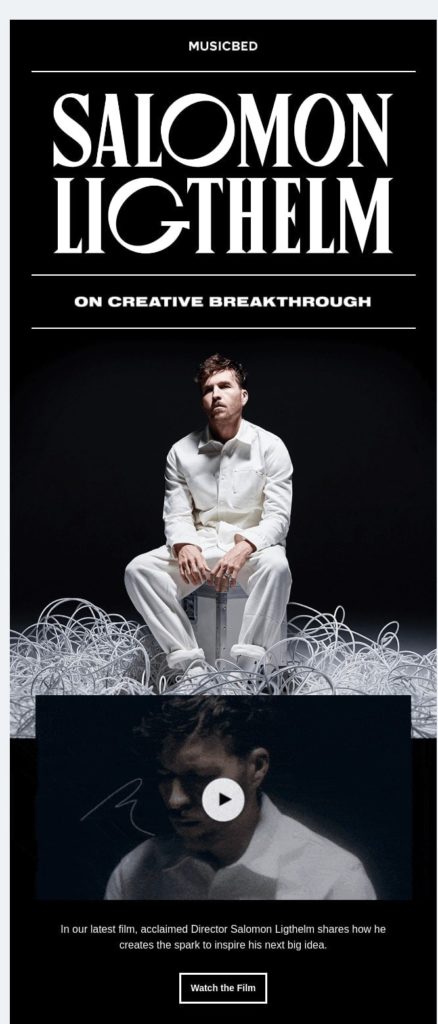
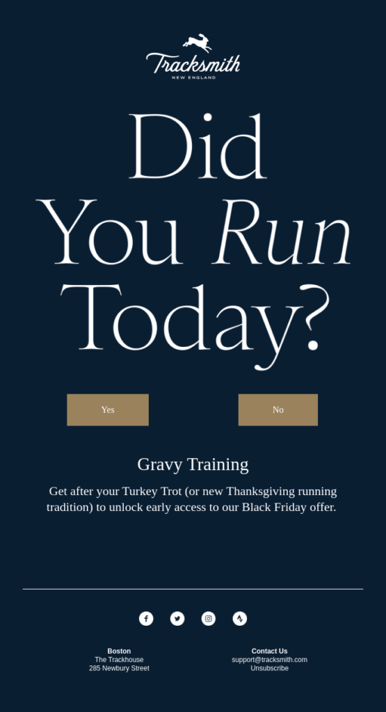
Although this trend is on the rise, it must be used with caution: the risk of overdoing it and compromising not only accessibility but also optimization for mobile is just around the corner.
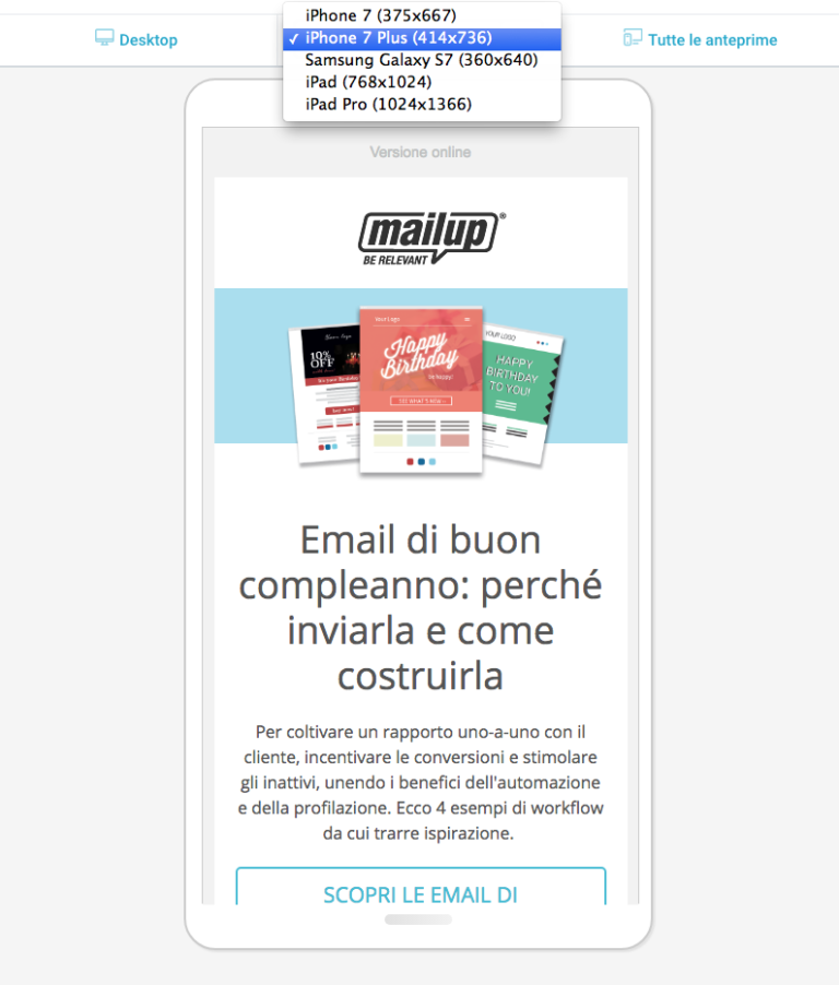
If you want to follow this trend, we suggest rendering the message on different mobile customers using features such as the Message preview option in the Summary section of the MailUp platform.
Images are becoming more and more tangible, real, and alive
A common thread of the various trends in images of 2021 is the search for greater concreteness and realism. Whether through the addition of animated details, tangible visuals, or three-dimensionality, there is a desire to give the message’s images authenticity and life.
Animation in the details
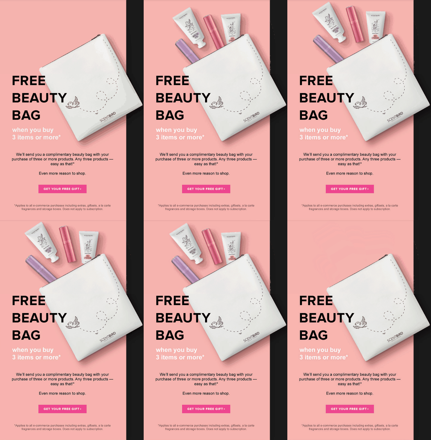
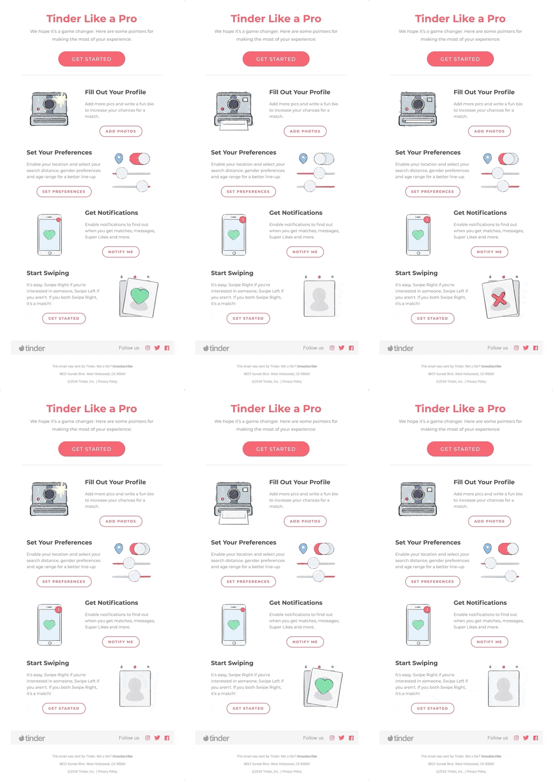
Animations have also been affected by this minimalist influence. Instead of being the workhorse to bet on and the focus of email design in 2021, these elements have become subtle, almost imperceptible details just barely added to photographic or illustrated images to help them stand out, complete them, and add a touch of life and movement to the message.
Tangible visuals and 3D images
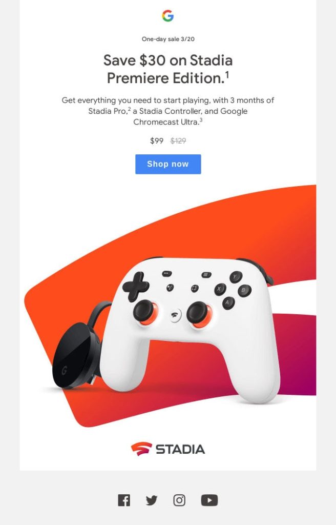
3D images were one of the trends of 2020 and will continue to be the protagonists in inboxes this year as well.
With the success of e-commerce and the physical restrictions that incentivize online shopping, tangible visuals are an effective and strategic tool to facilitate consumer purchasing decisions, offering a concrete idea of what an object really looks like through three-dimensionality or the use of macro images that make every single detail easily identifiable and extremely realistic.

In summary
Email design is a constantly evolving universe, and every year we witness the rise of new trends and the original use of colors, fonts, and images to create email campaigns that can make a mark and stand out among the dozens of emails people receive daily.
Our advice is always let these trends inspire you while also maintaining a consistent style and image of your company and, of course, your own identity.