Which Email Layout Is The Best?

If it’s true that the content a brand wants to convey gives an email its form, it’s equally true that defining certain structural constraints is another best practice of email marketing.
An email’s composition is based on the balance between content and layout. Method must always be added to creative freedom in order to avoid getting carried away by improvisation (never too profitable in marketing) and to be able to count (always and anyway) on a structure that acts as a backbone to varying emails, from the simplest and most minimal to the most complex.

From developing integrations to strategic support, from creating creative concepts to optimizing results.
Today we’d like to explore this compositional method, taking a closer look at possible email layouts, from macro design elements to defining details. There are 4 operational steps, let’s take a look at them.
1. Opt for a modular structure
A modular structure is the fundamental ingredient that gives an email the ability to be mobile responsive. This design structure is unanimously considered the most correct and complete, since email flows are now more and more oriented to smartphones.
The principle of responsive design is actually quite simple: the content of the message adapts to the width of the screen according to rules dictated by CSS media queries. We have explored this theme far and wide, contrasting it with non-responsive and mobile friendly types of emails.
Modular, on the other hand, means building an email according to non-fixed structures, but through blocks of content that are reorganized based on a different grid that depends on the media query detected at a specific moment.
Let’s take our latest newsletter as an example. On a desktop display, after the hero content, the other items are paired in two parallel boxes.
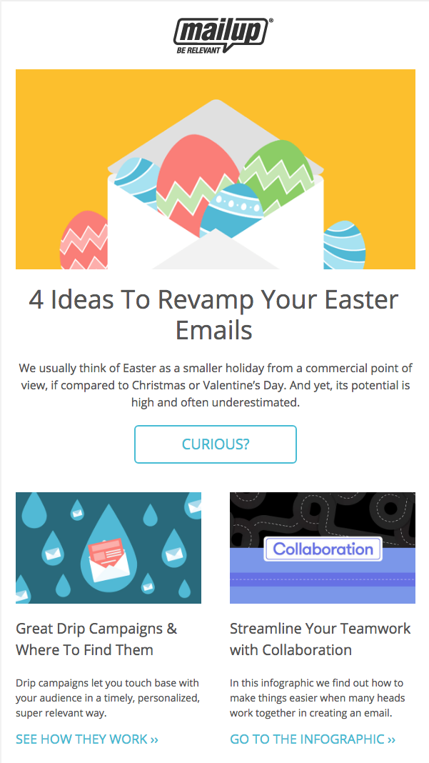
In the mobile version the structure is instead reorganized, putting the individual boxes in a vertical form which, arranged one after the other, have clearly legible elements (title, description, and call to action), even on the smallest screens:

But let’s get to the point, which is perhaps what readers here are most interested in. To give emails a responsive design, you do not need to know HTML or know how to design. All you need is an editor like BEE, which is integrated into MailUp and lets you create emails with a modular design that are automatically optimized for mobiles with simple drag and drop operations.
2. Set the orientation of the content
Now we know how indispensable modular design and email editors are. The next step is to define the type of orientation that you want to give to the content.
The orientation has a clear objective: to reflect the reading dynamics of recipients. This may seem to be a theoretical topic, but it actually has profound practical implications on the creation of the email by the brand and on the use of the message by the recipient.
Assuming that recipients are much more likely to skim an email than to read it line by line, four general groups of orientations have been identified. Let’s take a look.
The inverted pyramid
This is the best known and most frequent layout criterion for some types of emails, i.e. those that are limited to a preview: a teaser of offers, products, and news. Here’s an example.
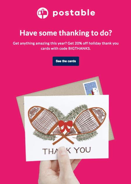
As you can see, the orientation accompanies the reader along different reading levels:
- Main copy, which offers the first context
- Description, which includes the essential points of the offer
- Call to action, which invites the recipient to learn more.
The outline of the inverted pyramid is quite clear:
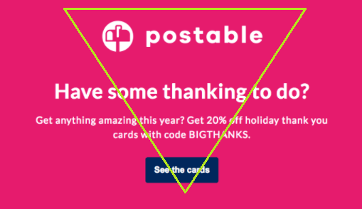
It offers a functional reading model, because it adheres to the ultra-fast reading genre (the skimming we mentioned earlier) that characterizes the use of email today.
Modular Complexity: ★
Content Density: ★
Orientation to click: ★★★★★
The Gutenberg diagram
The following compositional techniques were created for the design of websites and landing pages, but we consider them valid reflections for the email world as well.
Let’s start with the Gutenberg diagram, which describes a model in which the reader’s eyes move among content distributed in a homogeneous and uniform way. It is a particularly functional compositional model for emails with dense content including text and images.
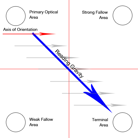
This model was made popular by Edmund C. Arnold, who many consider the father of modern editorial design; he is responsible for over 250 layout projects for newspapers and magazines in the United States and New Zealand.
The Gutenberg diagram divides the layout into four sections:
- Primary optical area
Top left, where reading normally begins - Strong fallow area
Top right - Weak fallow area
Lower left - Terminal area
Bottom right, where skimming stops
The model assumes that the eye skims over the page in a series of horizontal movements called orientation axes, but that the general movement starts at the primary area and ends at the terminal area in a diagonal direction: this trend is called reading gravity.
Considering that the uncultivated strong and weak areas fall outside the reading gravity, the recommendation for brands is to place the important elements along the reading gravity path. Here is a good example, whose only fault is the barely prominent call to action (the terminal area).
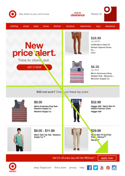
We must point out one more aspect of the Gutenberg diagram: the model is only valid if there are no hierarchical distinctions between the blocks of content. As soon as the position and preeminence of a block is accentuated, everything stated above is rendered null.
Modular complexity: ★★★★★
Content density: ★★★★
Orientation to click: ★★
The Z-Pattern
As the name suggests, this layout model follows the shape of the letter Z, assuming recipients start scanning from the top left, move horizontally to the upper right, then diagonally to the bottom left, before closing the path on the lower right side.
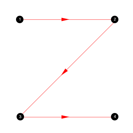
The difference between Gutenberg and Z-Pattern lies in the fact that the latter also uses the blind areas of the Gutenberg diagram. In short, there are no strong and weak areas, nor diagonal reading gravity.
Modular complexity: ★★★
Content density: ★★★
Orientation to click: ★★★
Zig-zag is an extension of the Z pattern in which the Z is multiplied. It is the method we use to read large blocks of text in a natural way. This model is particularly suited to a page full of images and content that invites the reader to skim rapidly. One of the best orientations for e-commerce sites is the zig-zag model, as it is perfect for product catalogs.
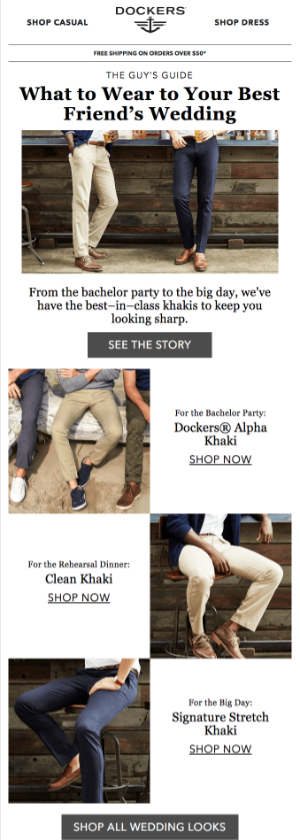
Modular complexity: ★★★★
Content density: ★★★★
Orientation to click: ★★
The Z-pattern can even be further articulated, this time by eliminating part of it: by closing the first three points of the Z we obtain the so-called Golden Triangle, i.e. the most viewed area of emails. That’s why the use of a Z- is often pattern is often recommended, placing the most important information within the three points of this triangle.

Modular complexity: ★★
Content density: ★★★
Orientation to click: ★★★
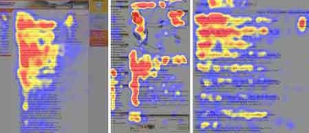
The F-pattern
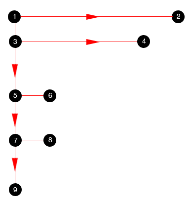
Let’s go backwards in the alphabet from Z to F. In this case, readers begin skimming at the top left and continue horizontally to the right, then start all over again while gradually reducing their “momentum”.
Nielsen conducted a study to prove this. In these heat maps the Fs stand out quite well:
3. Define the blocks’ arrangement
Now we’ll move on from theoretical layouts to actual ones. Combining modular design with the possible orientations, we can define 3 basic layouts for email content:
- Single column
- Multiple columns
- Hybrid layout
The right design will direct the recipient’s attention to the content itself, leaving the structure that supports it implicit. The suggestion is therefore an invisible structure, which has the task of combining compositional harmony with content readability. Let’s dive into the details of the three possibilities.
Single column layout
The single column layout consists of one or more modules that fill the entire width of the email and are piled one on top of the other. InVision takes full advantage of this kind of layout.

Benefits
- Easy to read
Single column emails have a clear hierarchy: they start with the most important content, and continue in order of relevance. One module after another, without compositional complications. - Narrative layout
The single column supports an email’s storytelling, accompanying readers along the message’s various content all the way to the call to action: a real epilogue.
Orientation ⇾ Inverted pyramid
Multiple column layout
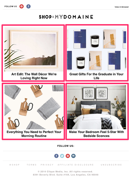
A multi-column layout separates content into two or three levels, arranging it within a kind of grid, as in this example:
Benefits
- Capacity and order of the email
Organizing products within a grid lets you show many items together - Image-oriented
If your email is based almost entirely on images which don’t require large descriptive text, a multiple column layout is perfect for you.
Orientation ⇾ Gutenberg Diagram, Z-Pattern, Zig-zag Pattern
Hybrid layout
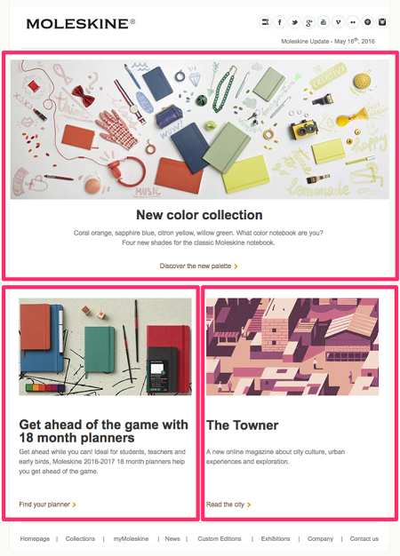
Many brands send emails with a main header at the top and secondary content in multiple columns underneath. This is a hybrid layout that goes from a single column to a multiple column outline. Here is an excellent example from Moleskine (we have marked the outline of the layout in pink here, too):
Benefits
- Perfect for adding hierarchy
By starting with a single column layout, the first and most important content module will not lose its importance. - Perfect for multiple calls to action
If you have multiple pages and places to send readers to, or want to stimulate the recipient to carry out multiple actions, this layout offers the greatest degree of flexibility.
Orientation ⇾ Z-Pattern, F-Pattern
Wrap up
Finding the best email layouts for your content is one of the first, basic steps of an email marketing strategy. It means knowing which layout works best for a specific category of your brand’s emails.
MailUp’s BEE editor offers a large variety of templates (immediately ready and responsive), as well as advanced features to define your layout gallery: a sort of toolbox to be used according to needs. Choose one, then enter the content and refine the email design in detail.
BEE is integrated into MailUp. All you need to do to try out its features is start a free trial of the platform. The 30-day trial will give you the chance to discover all the resources the platform offers for email design and email marketing.
