Email Preheader Best Practices

Email preheaders, summaries, Johnson boxes, and headers are different ways of referring to the same, fundamental email element: that line of text that follows the subject and introduces the content the recipient will find within the message.
Today we will delve deeper into this topic, because there are still many companies that neglect the preheader, often leaving it blank, with consequently poor results. So let’s take a look at what it is, what advantages it offers, and some advice to fully exploit its potential depending on the objectives.

From developing integrations to strategic support, from creating creative concepts to optimizing results.
What is an email preheader?
The email preheader is that short line of text in the recipient’s inbox that is displayed after the subject. On a desktop, it looks like this:

The preheader is an email’s third reading level displayed in the inbox. In fact, it is the part of the copy that integrates the subject and provides an additional frame of reference to help the recipient get an idea of the email’s contents.
The preheader’s creation is a direct consequence of the continuously increasing volumes of emails that reach our mailboxes on a daily basis. Due to such huge traffic, it was necessary to provide users with more content to help them determine an email’s relevance. Not only is it a frame of reference for recipients, but it is also an extra foothold for brands to break through and lead people to click or tap on the screen.
Here is the main point: a clear and self-evident preheader is not just a courtesy towards recipients, but a strategic element that works within the marketing funnel threshold as an element used to convince recipients to open an email. Adding and improving the preheader leads to an increase in open rates which in turn stimulates the other Email Marketing KPIs, particularly those which are most desirable for brands: CTRs and conversions.
Technically, why should you write an email preheader?
Let’s set aside the subject, and look closely at the email preheader to better understand the purpose of this small, fundamental preview of content. There are several reasons for this:
Offers a third level email preview
By integrating the other elements of an email displayed in an inbox, the preheader helps create a reading path on three different levels:
- Sender, which in Email Marketing is configured as the title, can offer the very first fundamental contextualization: Who is writing to me, which field do they belong to?
- Subject, which announces the topic that specific communication relates to by answering the question: What is the sender writing to me about?
- Preheader, which offers a preview of the content, highlight, or preferably, the key concept behind the communication: What is the sender telling me, what does it want me to do?
Let’s look at an example:

In an age where we have less and less time, where we browse instead of reading, where our attention threshold has dropped and so on, it seems an unnecessary sophistication; but instead, it is its exact opposite, as it offers recipients a chance to get an idea using three text levels, helping them screen what is and is not relevant in a quicker and more immediate manner.
Supports mobile users
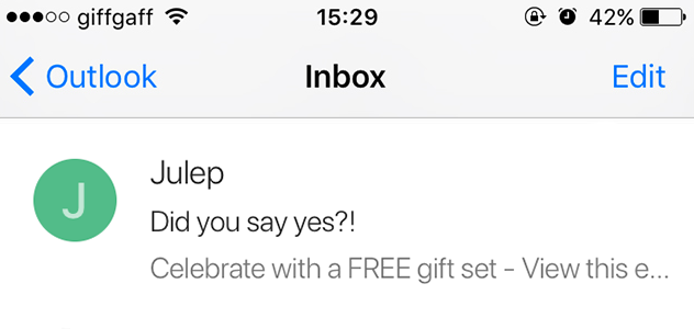
49% of users open emails on smartphones, and preheaders in the mobile version are almost more prominent than the subject: if the latter is cut, most of the time the preheader appears in its entirety. For those who read emails on mobile devices, this is an essential incentive or disincentive for reading them which is equal to if not more important than the subject. Here is the previous example, as it appears displayed on a smartphone. The preheader is without a doubt more thorough than the subject:

It helps reduce spam alerts
You may already know that every email address has its own reputation. The topic of deliverability is of great importance: the ability to deliver a brand is at the center of a dense network of cooperation and relationships between the players involved (ESP, ISP, anti-spam, etc.). One of the factors that can affect reputation is linked to subscribed users’ possibility to mark email as spam. For this reason, by adding the preheader you provide recipients with the opportunity to fully understand the contents of the newsletter, to make sure that it is not spam, and to avert the risk of abuse reporting.
Best practices for writing a good email preheader
Is it possible to make choices capable of optimizing this element with just 100 characters? Yes, the usable spaces are there, and must be exploited. Here are some best practices:
Focus the key content in the first half of the preheader
As already mentioned, there are more and more mobile views, and we have also mentioned the superiority of the preheader over the subject. Remember to add concepts, data, and terms that you want to highlight within the first 35 characters (34 on an iPhone, which become 60 in portrait view). Are you sending a flash sale email? Make sure to add the discount percentage in the first half of the preheader.
Take advantage of all the characters available
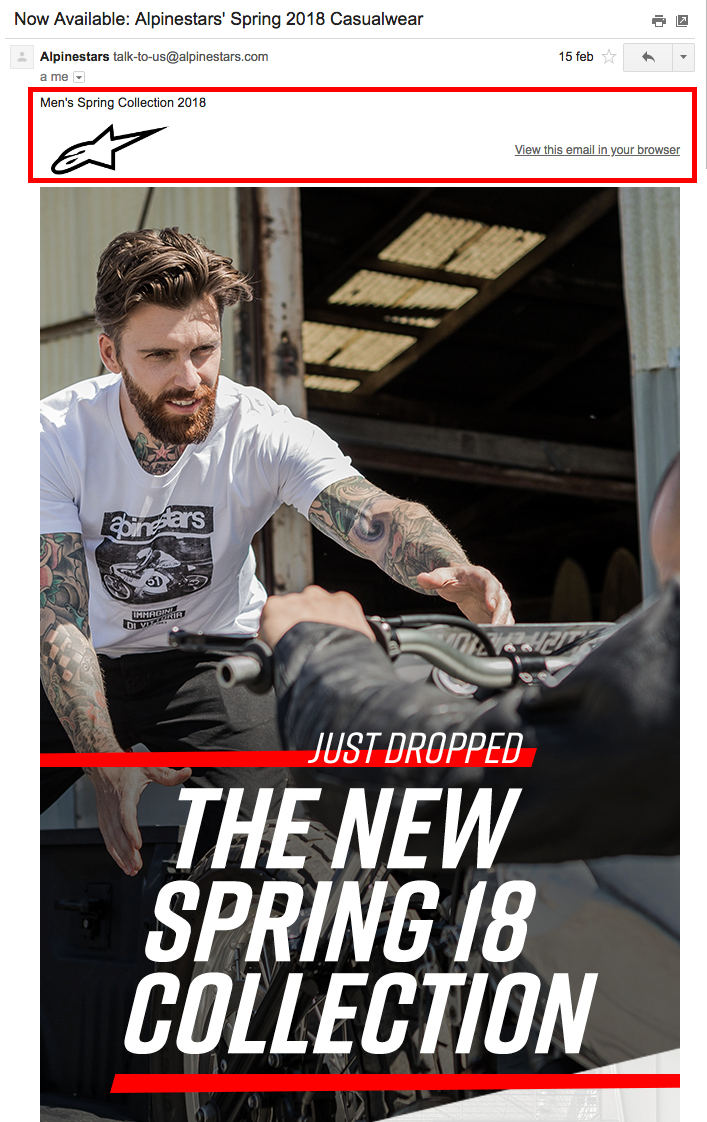
Gmail is the most used client in the world; consequently, special care is needed to comply with its characteristics. For this reason, keep in mind that Gmail displays between 100 and 110 characters including spaces. MailUp provides 100 characters for writing the preheader. We therefore highly recommend using all 100 characters, so that the summary does not display unrelated and disconnected text. Remember that if not specifically added, the preheader will automatically show the first text string it finds in the email. The results will clearly be far from exciting, as in the following case (sorry, Alpinestars):

In this case, after the subject, a mass of disconnected words was created that were taken from the body of the email and automatically placed in the preheader. Here is the proof:
To avoid the hassle, some marketers create a form with fixed content for all emails that offers coherent content for the preheader. Let’s look at an example:
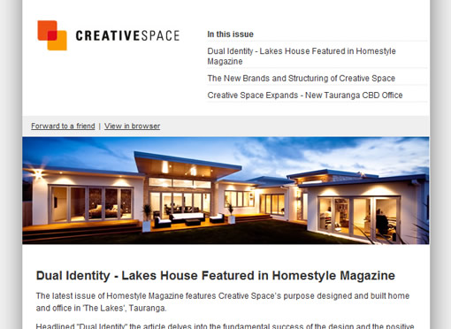
The first words drawn by the preheader make up a sensible and coherent text, a real summary: In this issue, followed by the news of each newsletter.
Include a call to action
Many emails we send are focused on a call to action. It may seem strange, but placing the call to action inside the preheader makes it possible to emphasize an email in the inbox, identifying the key action requested from the recipient. As you can see in the example below, Trenitalia uses the call to action approach in the preheader.
Experiment with emojis
On a more formal level, we recommend livening up the preheader with an emoticon: this is a rather common practice when writing the subject, but is used much less in the preheader. In reality, it is an excellent way to add a touch of color to that level of text that is most often dominated by an inconspicuous shade of gray. Here is the effect created by Mc Kenzy for Valentine’s Day:

Go against the trend and focus on conciseness
Among the many possibilities, you can also break away from the norm and focus on being concise; the preheader could be more functional and have more impact than using a lot of words. If the concept is strong and well-identified, you don’t need a lot of words. Not to mention that recipients are grateful for anyone who uses words in a wise and measured manner.
Email preheader: mistakes to avoid
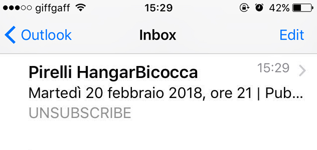
Including the unsubscribe option
This is not a winning choice, even if it could seem like an honest and transparent act towards the recipient. The preheader is not the place to do it however. In the example below, the unsubscribe option is isolated and in all caps, and adds nothing useful or relevant to the email displayed in the inbox:
Displaying the “Online version” option
This is the most common mistake: not writing the preheader and allowing the email to display the first words within the message in the summary, which most often shows text that offers the browser version of the email.

Repeating the subject
A choice based on laziness and of no use. When recipients see duplicate text in their inbox, they are likely to think it is an error and, in the worst case scenario, reach the conclusion that is was sent from an untrustworthy and suspicious sender.
How to add the preheader with MailUp
With MailUp, all the HTML steps that were needed in the past are not necessary for adding the preheader to an email. It can all be done in just a few clicks.
Once you have created your email or saved the changes you have made to a message, you will reach the Overview page.Here, after the subject, you will find the Summary field with the relative character counter (100 is the maximum, including spaces).

Haven’t tried MailUp yet? You can do it today, just request a free 30-day trial of the platform.
