HTML & Email: 6 Common Mistakes You Should Avoid

Error 1. Using overly verbose code
We know that thanks to HTML and CSS we can build an email structure and give it a form, or rather a format, that makes it possible to display a certain type of font, a specific background color, images and so on.
Now we’re going to see how both HTML and CSS tags carry out the same function in some respects, and end up overlapping. Let’s take a practical example: defining the background color for a table in both HTML and in CSS.

The code is shown in the image. You can see that there are two points where the background color is defined:
- bgcolor = “#e75c00” is the attribute of the tag table;
- background-color is the CSS attribute applied to the table.
Both attributes do the same thing, and so they overlap: they impose the orange color (#e75c00 according to the hexadecimal format) on the background of the table.
The critical point should now be clearer: the HTML and CSS property definitions can pile up on one another. In fact, when reworking or varying the same email model, the code can often get bogged by redundant properties that perform the same function.
And that’s not all. Since inline styles can be applied to every single element, this (perverse) case may also occur:
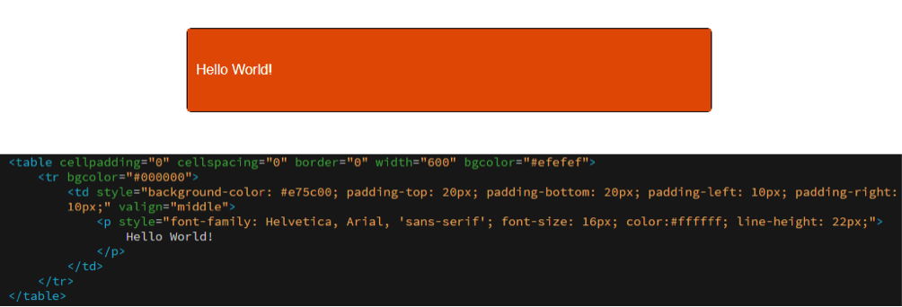
A browser (or email client) would read the code more or less like this:
- Apply a gray background (bgcolor = “#efefef”) to the table
- Ten apply a black background (bgcolor = “#000000”) to the row
- Finally, apply an orange background (background-color: #e75c00) to the cell containing the text Hello World!
The final result is identical in both this example and the previous one: white text on an orange background.
The problem is that three different background rules have been defined in the second case. The one seen by the user is that one defined in relation to the cell, because the browser reads the code sequentially (table -> tr -> td). Since the last definition was set on the <td> , that is precisely what will be displayed.
It is clear that much of the code is not necessary. This is not only because the only background color displayed is the one applied to the cell, but also because one of the aims of good email marketing is to keep communications as light as possible. Very verbose, redundant code is not light code.
Our recommendations:
- Keep the code as clean as possible
- Avoid unnecessary repetitions when formatting the code
- Give preference to inline styles
- Try to build a modular structure for the communication code
- Try to keep the code as ordered as possible through indentation (there are several online services that do this, like HTMLformatter or Clean CSS), to be able have an overview of the structure of the communication
- Keep track of the history of macro changes made to a model

From developing integrations to strategic support, from creating creative concepts to optimizing results.
Error 2. Excessively commenting on the code
As with most languages, it is also possible to add comments to HTML. What is a comment in an HTML script? It is a portion of the listing that is ignored by the program that reads and executes the code.
An example of a comment is given in the figure below:
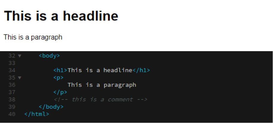
As you can see, everything between <!- and -> is not only a different color (depending on the editing program), most significantly, it is not displayed on the screen.
This allows “service communications” to be inserted concerning the code that has been written, or instructions for parts that have yet to be completed or which need to be improved.
There is also another way to use comments. Since everything included between the opening and closing markers is not shown, it is possible to conceal entire page parts with it, as shown in the following example. In fact, we can see that only three lines are visible on the screen instead of the four that are written in the code.
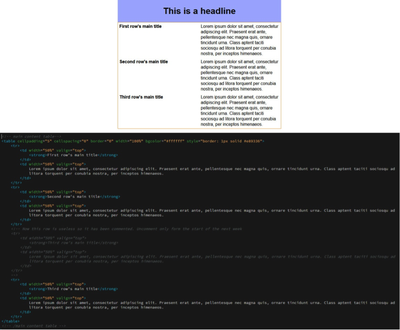
It is useful tool, of course, but we must not abuse it. While it is true that the commented code is not shown, it nevertheless remains in the communication sent, weighing it down.
Our advice:
- Use comments wisely, for example to indicate the beginning and the end of communication structures, or to insert useful information for the developer
- Do not be long-winded in the comments, and, better still, write them in English
- Delete the commented code before sending, as it is not necessary for communication purposes
Error 3. Mis-managing email content
When designing an email, even before writing a single line of code, it is good to define certain parameters that cannot be modified in the subsequent realization phase, and consequently during production.
Some of these parameters include:
- Email width
- Image size
- Number of images
- Font size used in the header
- Body copy font size
And so on. One parameter that is often omitted is that of the maximum number of key strokes for any text element.
At this point, you could object that we are guilty of being fanatical with the rules, but there are two good reasons for being so strict. The first is conceptual and the second one operational.
On a conceptual level, the content (text, images, etc.) and container (HTML structure) are two separate entities with a very precise hierarchy that sees the former subordinated to the latter.
In fact, the content should be adapted to the container, and not vice versa. The architecture of the communication is constructed when writing the code. This defines the container and, once shaped, the container remains such regardless of the content, even if the email has been created to be responsive.
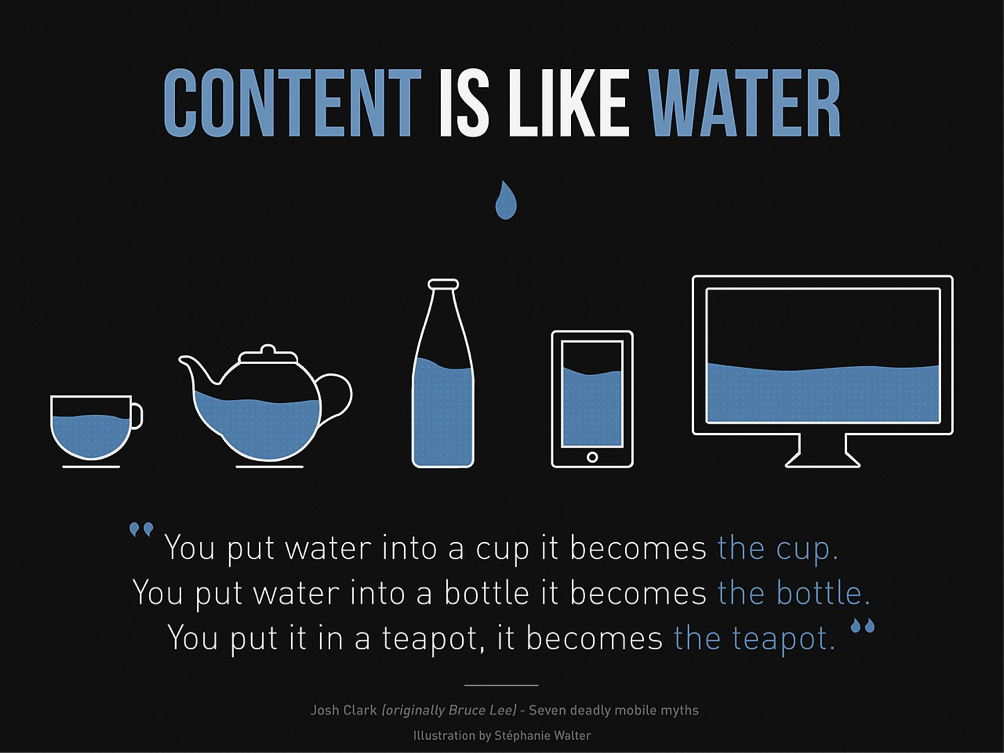
In summary – and paraphrasing Bruce Lee – the content is like water: if you put water in a cup, it becomes the cup; if you put water in a bottle, it becomes the bottle; if you put water in a teapot, it becomes the teapot.
You can’t expect a cup to become a bottle, and a teapot will never be a cup. Therefore, the text (or image or button) has to adapt to the structure that contains it, and not the other way around.
The second reason is more operational. If all the parameters for composing the communication are known exactly a priori, then not only is it possible to create more effective communications during the drafting phase, but also more balanced communications.
Let’s take a more concrete example: suppose we have a DEM with two products side by side. A product is usually associated with:
- An image
- The name of the product
- The description of the product
- The price
- The CTA leading to the product page
Now, since the products are side by side, the parts must necessarily be balanced.

This means that the images must have the same height, the descriptive texts must have a similar length and the two CTAs must not be too dissimilar.
Ignoring or not respecting these basic principles can lead to cases like the image above.
The symmetry between the two elements is broken because the product title on the left is so long that it covers three lines, while the one on the right is so short that it only fills a single line. A discord has been introduced, which ultimately weakens the whole communication.
Compliance with these rules becomes even more important when thinking about the mobile world, where all the various devices have very disparate resolutions: from the 1125 x 2436 px of the iPhone X to the 1440 x 2960 px of the Samsung Galaxy S8, passing through the 768 x 1280 px of the Microsoft Lumia 1020.
When this huge diversity overlaps with the dense jungle of email clients, it means that we don’t have total control of the DEM display, because there is no definitive code that adapts to the pixels in every case. So, if you can’t control it via code you must try to do it indirectly, by altering the other parts that comprise an email, such as the length of the texts or the size of the images.
Our recommendations:
- Define all of the parts of the template
- Stay consistent between the different parts of the communication
- Respect the rules you have given yourself
- The rules can be broken, but this must be done with full awareness
- If the template does not meet your needs, you can start thinking about defining a new one
Error 4. Getting interactive phone numbers and addresses wrong
Sometimes, email senders add their contact information, especially in the footer. This usually includes an address and a telephone number.
While a phone number and address can be standard information for desktop client emails, although they are rarely used, these elements are particularly important when it comes to the mobile side.
This mainly happens for two reasons:
- You can open an app that manages the data with a click (calendar, phone, browser)
- The display space is reduced, and as such every piece of information has greater visibility, even if located in the footer
It is therefore important not to forget also these details when developing the communication, as their behavior varies across the different devices.
Let’s take a moment to consider example created ad hoc through a simulation. Both examples are displayed by iPhone 6+ iOS 9.
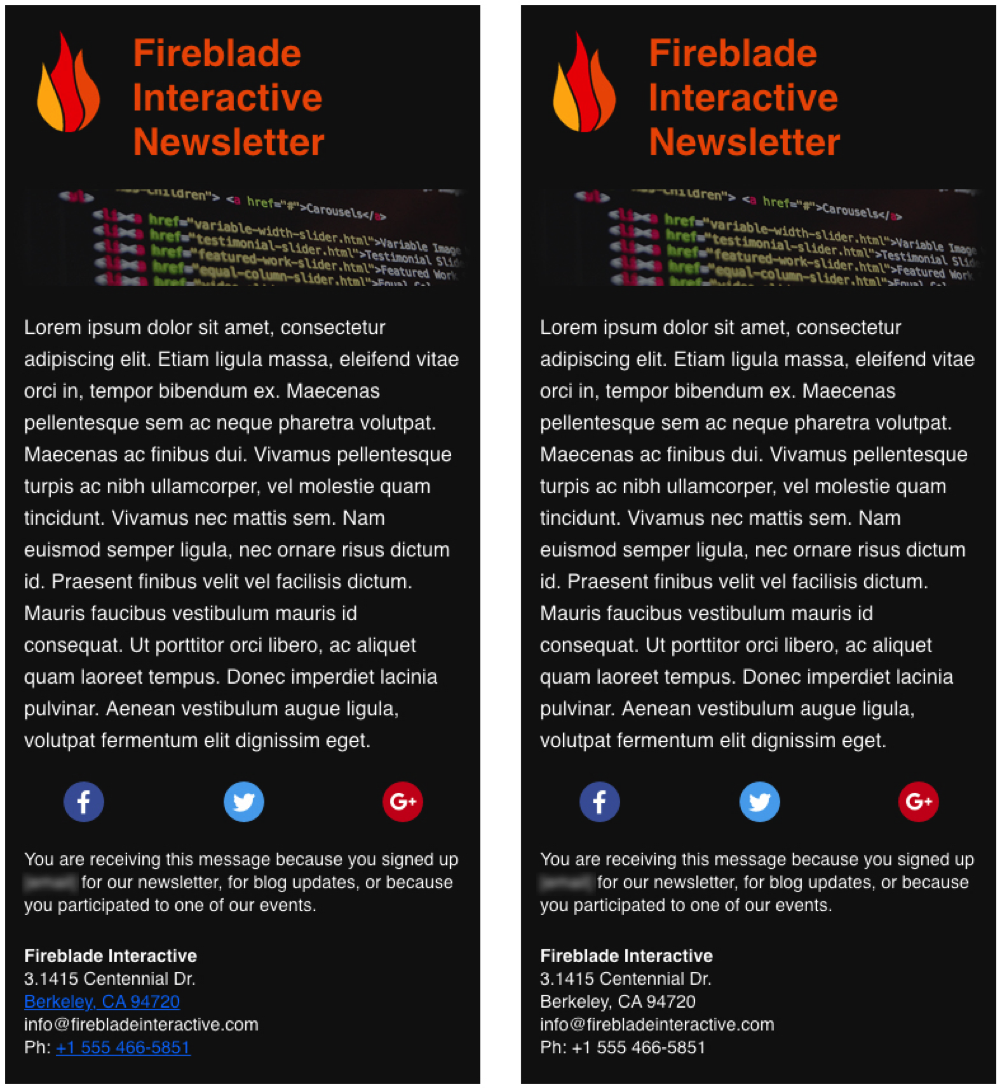
The image on the left shows the newsletter received by the user with the text entered directly, without any formatting.

Everything is correct from a technical point of view, but we must take into account the fact that code is interpreted by the email app itself on the mobile. It “reads” the text of the email, and when it recognizes text in the form of a date, an address or a phone number, it automatically links the active link to the respective app, i.e. the Calendar, Map or the phone.
This is all very convenient, as just one click allows you to make a phone call, schedule an event or open the map to set a route. The only ones who can be sad about it are the art and the developer, who don’t like to see the blue links and the underlining. So what should we do? How should we proceed?
You can use a small workaround or trick to bring things back to normal. Let’s be clear: although they break the rules of well-formatted HTML, workarounds are indispensable in the vast ocean of email clients.
If a developer’s main goal is to make the communication visible on as many clients as possible, then they need to compromise and embrace the workarounds.
So let’s see how the code was altered.

When it comes to the telephone, it’s simple: since the anchor tag makes it possible to define a telephone number by using tel in the property href, we add the telephone number without any spaces or lines of separation.
We need to act in a different way for an address or date, however. For these, it is necessary to define a class (.address) that imposes the anchor tag that will automatically insert the color within the client (color: #ffffff;). Above all, it should removing the underlining, which is a default feature of each link (text-decoration:none;).
Note that both attributes of the address class have !important , which must be applied by the client regardless of the property. Without it, there is no guarantee that the workaround will do its job.
Our recommendations:
- Always pay attention to how the communication can be displayed on mobiles (i.e. by doing tests)
- Where possible, use micro-fixes to make communications mobile-friendly
- Do not assume that what is good for desktop is also good for mobile
- Know your audience: which technology do they use? Which devices? Which media?
- Use internal tests to experiment with your own communications, especially when there are substantial updates to email client apps
Error 5. Not cleaning up abandoned or empty tags
Continuing with the objective of trying to keep the overall weight of the communication to a minimum, we need to pay attention to the parts of the existing code that have been emptied of their natural content.
Let’s give a concrete example right away: a <font> tag, perhaps with a series of inline styles, that does not contain any text. Obviously, the email side will not be able to read anything, but the <font> formatting tag continues to exist and occupy physical space in the email.
Another classic example is the <a> anchor tags that have no linked object, so something like: <a href=”http://www.mailup.com” style=”color:#00000;text-decoration:none”></a>.
Usually these “errors” are present in that code that has been reworked or used many times, so that different parts, such as images, links and texts, have been inserted, modified or deleted. Alternatively, it could be an indication of incorrect use of a WYSIWYG editor. In fact, if used badly or imprudently, these editors have the defect of adding code to code, since every predefined element normally has a part of the code defined from the time the editor itself was created.
The program uncritically applies the model every time the selected element is inserted, and as a result this problem can arise when you rewrite the same part of the email a sufficient number of times.
Our advice:
- When writing the code, always check that there are no abandoned or empty tags
- If you use a WYSIWYG editor and it is possible to access the code, carry out a check to ensure everything is in order and there are none of these kinds of errors
Error 6. Using non-validated HTML
Talking about validation for email code is something of a thorny topic.
“Most pages on the World Wide Web are written in computer languages (such as HTML) that allow Web authors to structure text, add multimedia content, and specify what appearance, or style, the result should have.
As for every language, these have their own grammar, vocabulary and syntax, and every document written with these computer languages are supposed to follow these rules. The (X)HTML languages, for all versions up to XHTML 1.1, are using machine-readable grammars called DTDs, a mechanism inherited from SGML.
However, Just as texts in a natural language can include spelling or grammar errors, documents using Markup languages may (for various reasons) not be following these rules. The process of verifying whether a document actually follows the rules for the language(s) it uses is called validation, and the tool used for that is a validator. A document that passes this process with success is called valid.
With these concepts in mind, we can define “markup validation” as the process of checking a Web document against the grammar (generally a DTD) it claims to be using”.
W3C helps us as a guardian and guarantor of the code by providing a code validation tool whose analysis indicates errors and suggests ways to correct them. Thanks to this tool, it is possible to identify and correct larger structural errors.
It’s worth remembering that Email Marketing has a twofold situation:
- On one hand, HTML is a standardized language with very precise rules and structures
- On the other, a series of workarounds that are not standard, and are often frowned upon, but which work well if you want to have correct visualization on email clients
These two aspects are like an old married couple, where the passion has long since fizzled away. They do not know why they are living together, but they are forced to do so by making compromises.
So why talk about code validation? Does it make sense? What are the compromises?
It makes sense to talk about code validation when it is placed in a broader perspective, without going too far into the particulars. Therefore, when it comes to the structure, the modules from which the email is composed, and the tables that constitute the backbone of the communication, it makes perfect sense to have code that is as clean and as close to the standard dictated by the W3C as possible.
However, we have to be aware of the reality, and so the compromise consists in the creation of a solid and functional structure, to which the workarounds are added as a kind of fine tuning to extend correct visualisation to as many clients as possible.
We already know that workarounds are nothing more than exceptions to the rule, or not perfectly orthodox techniques, derived from knowledge accumulated through experience, but their existence only make sense because they allow the code to be correctly visualized, without any depagination.
Our advice:
- If you have doubts about the code, validation can serve as a quick and effective tool for analysis
- Code validation can be a good tool for quickly identifying the biggest errors in a code listing
- Validated code is always an excellent starting point for subsequently evolving and adapting the communication with workarounds, to make it as universal as possible
- Validation can be seen as “servicing” for the code, especially on models that have be frequently manipulated and reworked
- As you gain experience, build up a small library of ad hoc solutions for various clients in order to save time when problem solving
