How to scientifically select super persuasive images for your emails

In online promotion it’s essential to know how to attract attention and consequently persuade people to take action and responding to you. This is even more evident for Email Marketing, especially when it’s aimed at generating profiled contacts, where the competition for receiving and attracting inbox attention is increasingly fierce.
Therefore, use a scientific (i.e. replicable) method to capture the attention of your potential audience and aim it towards the decision-making process of purchasing.
Studying design, color and images on a theoretical level and carrying out continuous and various field tests is essential to consolidate an effective procedure and method that, regardless of who executes it, always leads to obtaining a professional and profitable result.

From developing integrations to strategic support, from creating creative concepts to optimizing results.
The 3 basic systems of communication
As humans have three tools that we use to exchange ideas with other people:
- writing. Writing words, having them delivered to the person and having them read allows for communication (just what we are doing now). It’s definitely a sophisticated level, because it requires knowledge of an alphabet, the ability to write concepts using these symbols and the ability to read and interpret the terms in order to replicate them.
- speaking. Communicating through the voice expressing concepts understandable to another person is something we usually do, we take it for granted but it’s definitely an evolved level of communicating. Just think of when we go abroad or meet someone who does not speak our language: in those moments communication through the word is less familiar
- gestures. A very simple way to communicate is through gestures and facial expressions. For example, we can understand a message of antagonism even only from the expression and posture of those in front of us and this makes gestures a very immediate, albeit primitive, tool.
Now the question arises: which of these 3 systems communicates in a simple and direct way to our thought processes?
If you answered gestures, you were right! And gestures mean what we observe, therefore images.
Having made this indispensable assumption to fully understand the importance of images in our life and, therefore, also in promotion, let’s understand what are the fundamental rules for scientifically choosing super-persuasive images.
1. Clearly define the message you want to communicate
To choose a communicative image, we must first establish what message we want to convey to the observer: an image must have only one message, it cannot have alternatives and must be unequivocal (or at least as misinterpretable as possible).
Let’s look at an example:

This image immediately expresses one thing: freedom
Once we have clearly established the message we want to convey, we must ensure that this communication reaches its destination and “convinces” the user to take a certain action.
The 3 key aspects of persuasive visual communication
To convince the user to take an action, these 3 essential rules of persuasive visual communication come to our rescue:
- The temporal scheme of perception
This concept is based on two key factors, the first is that for us Westerners time flows from left to right, so on the left we find the past and on the right we find the future. The second is that the things above are positive while those below are negative.
I have elaborated this concept on the basis of two key factors, the first is that for us Westerners time flows from left to right, so on the left we find the past and on the right we find the future (in eastern markets it probably works the opposite but not completely sure because I have not experienced it).
Instead the other assumption is that things above are positive while those below are negative, this derives from the simple observation: when we are happy, proud and positive we find ourselves with our heads held high while when we are sad, gloomy and negative we tend to lower the chin and the gaze.
In this sense, on a horizontal axis with the passage of time on the left as the past, on the right the future and on the vertical axis, the positive perception at the top and negative at the bottom, we can divide our image
into 4 equal parts of which two areas become decisive. The upper right corner will be the positive projection area, while the lower left corner will be the negative memories area.
An example of how this scheme works by analyzing an advertising banner:

In the banner, the left side doesn’t look for any emotion, while the right side shows the message of positivity, looking towards the future and above all directed towards the call to action that the recipient of the message will have to make: an “X” on the electoral logo.
The temporal scheme of perception
- Aesthetics
Very often, we come across people who believe that aesthetics is something subjective, when something appears beautiful, it is aesthetically pleasing, when it is ugly, it is not aesthetically pleasing. In reality, what you like is subjective while the concepts of aesthetics are purely mathematical and therefore highly objective.
Let’s take a deeper look into what these mathematical formulas are, that determine aesthetics. The first is geometric symmetry, for which over the years art historians and philosophers have developed and determined precise rules and elements considered symmetrical (such as order, formal rigidity, stillness, simplicity) and asymmetrical (like movement, freedom, chaos).
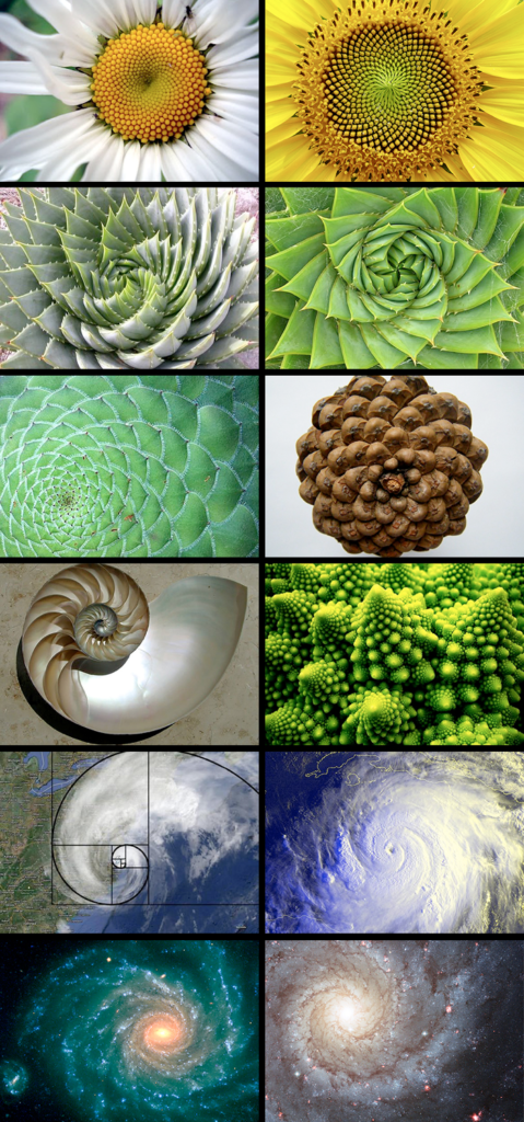
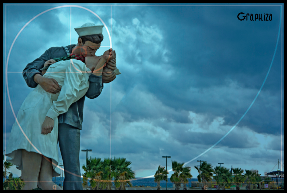
The second is the golden section (or rule of thirds), which represents a recurring expression in nature and which develops from the Fibonacci sequence, more commonly called Spiral to Snail.

In photography it has been called the rule of thirds and used to give the right balance and aesthetic harmony to the images, matching the main subject in correspondence with the third, as in this example:


The third and final rule is definition and sharpness. Nobody likes grainy images, they are synonymous amateurs and lack of professionalism. So always use images with high sharpness: they will be very persuasive because they are so real and therefore intriguing for those who observe them.
- Identification
The winning key to excite our potential client is to make him identify, make him experience the emotion present in the image and then receive the message we want to communicate in the first person.
In this regard, there are 4 essential measures to make this happen:
- Improving mental projections: the subject of the image must be similar to our message target audience but at a higher level of status (well-being or vitality). Be careful here not to overdo it otherwise our potential client will no longer identify with it if the client is young and we use a positive projection of a baby☺.
- Appropriate clothing: the subject of our image must be dressed in a manner appropriate to the role he plays: a doctor must have a coat over the shirt with a tie, a chef must have a typical uniform and a chef’s hat, a house painter must have the overalls, etc.
- Setting: the subject must be surrounded by an environment and objects that are in line with his profession and with the message. If we were to visit a new dentist, we look at the cleanliness of the equipment and rooms before we develop trust … the same happens with an image
- Action / Interaction: how does the subject interact with the surrounding environment? Are they doing something? Here is a type of activity that if we followed the previous points well, it will work and make those looking at our image experience the same emotion. So if the subject is relaxing, the recipient will experience relaxation, if the subject instead points to an object in the room the recipient of our message will be prompted to look at that object.
2. Be minimal and only use elements that reinforce your message
Therefore, eliminate any distractions that don’t reinforce the message. This is because if you tend to embellish, the result it is often something very confusing, which does not hit the mark. Once the superfluous has been removed, leaving only the necessities that strengthened the message, that’s it: we have our super persuasive image.