Design a Standout Subscription Confirmation Email
You may be missing out on a great opportunity to reinforce your brand’s value proposition and get subscribers to engage with your brand on a deeper level. In today’s post, we’ll look at a few ideas and tips with plenty examples on how to improve your subscription confirmation email.
The subscription confirmation email explained
Most email service providers require new subscribers to go through a two-step process to sign up for a mailing list. The process, called a double-opt in or confirmed opt-in, is a common one and goes like this: after a reader enters her email address in a signup field on your website, she then receives an email that asks her to confirm her desire to subscribe. For example, the subscription confirmation request message of Email Design Workshop looks like this.
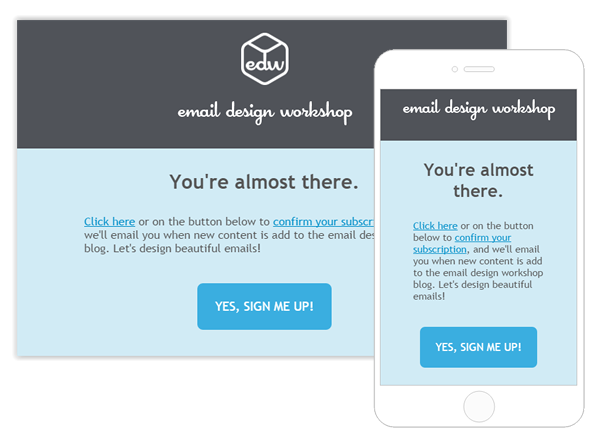
Asking readers to confirm their subscription makes for a cleaner, more engaged subscriber database. Readers who confirm their subscription want to receive your emails; there’s no chance they signed up by accident. It also reduces spam complaints, and it benefits subscribers because it means no one else can use their email address to sign up without their consent.
It’s no wonder the double opt-in process has become a best practice for email marketers.
But… the double opt-in process also has an obvious pitfall: not all initial subscribers will confirm their subscription, and thus won’t make it onto your list. According to Campaign Monitor, up to 20% of initial subscribers will not complete the final confirmation step. The email might get overlooked or accidentally deleted, or readers may not understand the confirmation process. One way to reduce the problem is to send an automated follow-up and ask them again to confirm their subscription (here is how to do it with MailUp, for example). Still, you can see why it’s so important that subscription confirmation emails are clear and simple, making it as easy as possible for readers to understand what to do.
From developing integrations to strategic support, from creating creative concepts to optimizing results.
Subscription confirmation emails: a missed opportunity
The format of subscription confirmation emails are usually standardized by an email service provider, which means they generally lack personality. In a way, it makes sense: email marketers need readers to click a button, first and foremost, and the decoration, deals, and fanfare can be saved for the welcome email that comes later.
So confirmation emails are usually pretty stark and basic, like this one from Vice:

But lately we’ve seen some brands break out of this mold, making simple design choices to ensure their subscription confirmation emails get more attention, work effectively, and maintain the brand’s family feeling.
Make a great first impression with your subscription confirmation email
Subscription confirmation emails should be simple and streamlined, but they should also reflect your brand. This is your opportunity to make a first impression with readers and confirm their desire to receive emails from you. To do so, we recommend you follow these best practices.
Tip #1: Use a large, easy to find CTA button
Your email service provider should give you the option to include a bulletproof call-to-action button in your subscription confirmation email. Use it! This button should be the key focus of your email. That’s why they’re typically large with clear, descriptive text. A button that simply said “Confirm” wouldn’t necessarily make it immediately clear about what the reader’s action means.

If you don’t have the option of including a CTA button, link the entire subscription confirmation sentence so it’s eye-catching and easy to click, like in this email. (But be sure to customize your header text — don’t just leave the word “General” sitting there!)
Tip #2: Customize the text
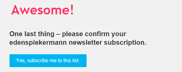
Don’t add any extraneous text that would detract from the key message and CTA of the email, but customize the language so it’s on-brand, welcoming, and enthusiastic. Think of this as a mini welcome email. Greet readers. Encourage them to click. Validate their initial decision to sign up for your emails. Here’s a great example of custom, on-brand, welcoming text from the agency edenspiekermann:
Tip #3: Be on brand
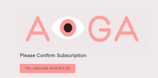
One of the simplest and most important things you can do to make your subscription confirmation email more effective is to include a header with your logo. Take it a step further and customize the HTML background color of your message to a brand color and the style of the CTA button (in addition to customizing the messaging to be in your brand voice). Think about it this way: A subscriber may sign up to receive emails and then forget about it, not checking email for a few hours. When he checks his email later and sees a message from you, can he tell right away what it is? On-brand email design is a must. Here’s a great example from AIGA, the professional design association:
Subscription confirmation emails that make a statement
So many subscription confirmation emails all look the same, but we found some brands who are making a statement—and providing a warm welcome to subscribers—with these stellar emails.
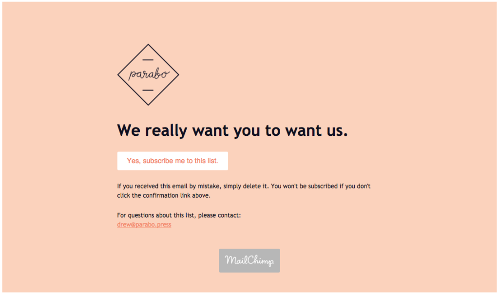
We got this email from Parabo, the print shop app, and smiled. Instead of the very standard “Please confirm subscription” header text, we were greeted with a funny, whimsical hello that’s totally in their brand voice. “We really want you to want us” is a clever way to break up the usual mundane greeting, and, guess what? It totally reaffirmed why we thought we wanted to sign up for their emails in the first place. Parabo also includes their logo in the header, and the HTML background color and call-to-action button have been customized to be on-brand pink. The email is simple, it only takes a second to read, but it still makes an impression. Job well done.
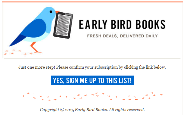
Early Bird Books is an email newsletter that highlights deals on ebooks. Their subscription confirmation email hits all the marks: it’s well branded in the header, the CTA button is the star of the show (it’s a bright contrast color against the white background, it’s big, and the text is clear), and the body text is simple but welcoming and enthusiastic. The bird prints along the bottom of the email are a nice touch, too, rounding out the look of this short-and-sweet introductory message.
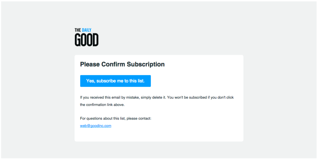
We’ve written about The Daily GOOD email newsletter before. It’s always well-designed and well thought-out, so it’s no surprise that the subscription confirmation email has a smart design. It’s simple, yes, but GOOD does something we haven’t seen in any other confirmation emails: the header is an animated GIF.

What a great way to show readers a preview of the beautiful, design-forward thinking from the newsletters to come.
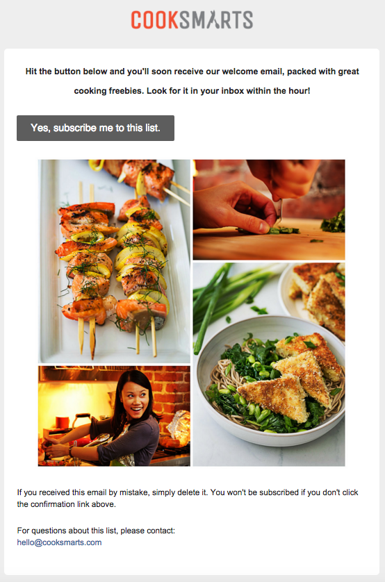
Cook Smarts, a company that delivers cooking lessons through free recipes, meal plans, videos, and infographics, has a subscription confirmation email that definitely serves up a delicious welcome. Here’s what’s great about it: not only are there beautiful, custom, high quality images that provide a great preview of what’s to come, but the welcome text tells subscribers exactly what to expect next (a welcome email with freebies) and when to expect it (within the hour). The info is useful for readers, encourages them to confirm their subscription, and tells them something about what to expect from Cook Smarts: great, timely communication. It goes to show how a little bit of thought can go a long way when you’re making an effort to make a strong first impression with potential subscribers.
Wrap Up
A subscription confirmation email is your opportunity to make a strong first impression with subscribers. Make it easy for them to confirm their subscription with these design tips:
- Make a bulletproof CTA button the focus of the email. Use a contrasting color with plenty of padding around it so it’s easy to tap.
- Keep the message short and sweet, but on-brand. Use your brand voice. Have fun!
- Try an HTML background color from your brand color palette to add depth to the email and make it quickly recognizable.
- Include a GIF or photos that make a statement about your brand and give readers a sense of what’s to come.
Just a few small tweaks can set you head and shoulders above most email confirmation emails. And if you’re able to design your own confirmation emails in an editor, try out some of these tips in the BEE editor!
This article was originally posted on the Email Design Workshop blog