Tutorial: How to properly incorporate GIFs in email

What’s exciting is that animated GIFs are actually pretty easy to use in email: they can be treated just like other image files, and they’re well-supported by most email clients. But in many GIFs in email, there’s a major problem: the email’s call-to-action is often inside the GIF, like in this email from Ann Taylor.
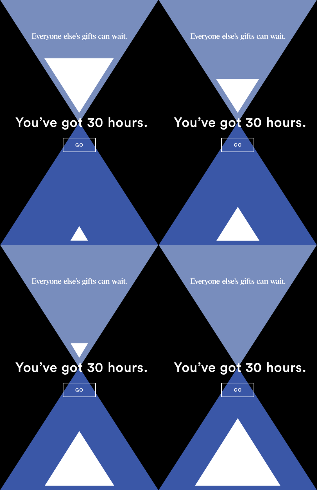
That “GO” call-to-action button isn’t really a button—it’s part of the whole image. Click above or below or anywhere around the “button” and it works just the same: you’ll be taken to a landing page on the Ann Taylor website, because the whole animated GIF is linked. That makes it easy for readers to tap or click almost anywhere to get more information (and hopefully make a purchase). But it can also be problematic. If the animated GIF doesn’t render for one reason or another, the email totally loses function. This can happen if…
- There are image size distortions on a reader’s mobile device
- Image-viewing is turned off on the reader’s email client
- The GIF is blocked with ad-blocking software
- The GIF is a large file and the reader doesn’t wait for it to load
Plus, Outlook users will likely just see a still image, because the animation won’t work. For these reasons and more (check out all the pitfalls of image-only emails), we always recommend taking an email design approach that optimizes HTML and doesn’t rely solely on images. Want to know how to use your awesome animated GIFs in email while still making sure your calls-to-action always show up? Read on.
From developing integrations to strategic support, from creating creative concepts to optimizing results.
Today’s workshop
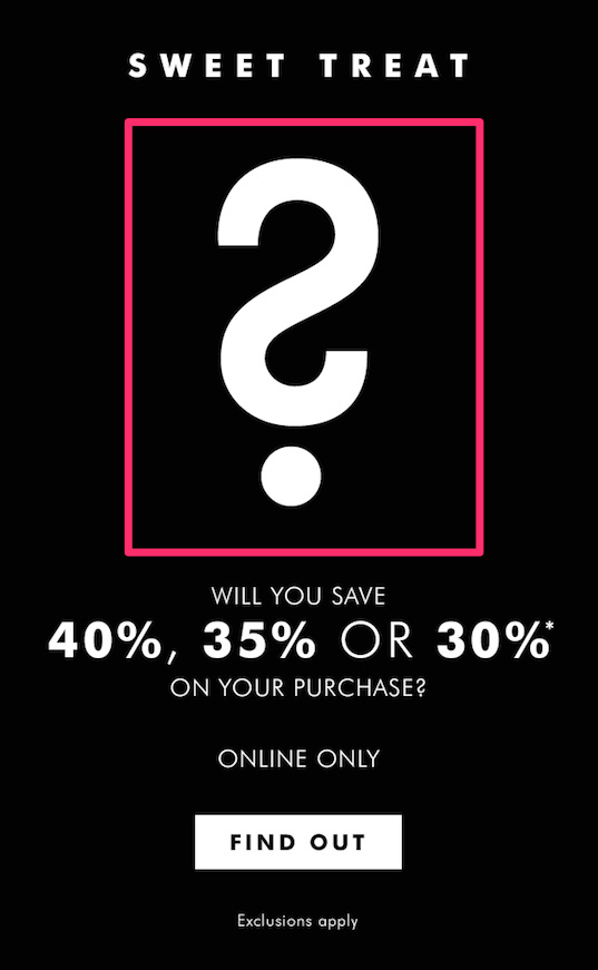
Today we’ll recreate the following email from Banana Republic and show you how to optimize the use of animated GIFs in email to make sure your content appears.
Here’s our video tutorial recap:
And, for reference, here’s the full email from Banana Republic:
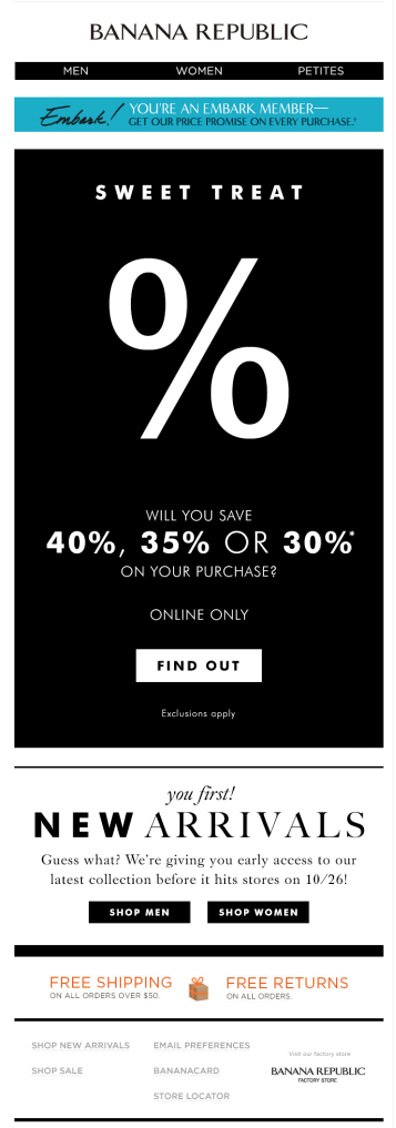
In Banana Republic’s email, the key message—including the call-to-action—is in one single image block, just like the Ann Taylor email above. Almost the whole email—the entire black portion—is an animated GIF:
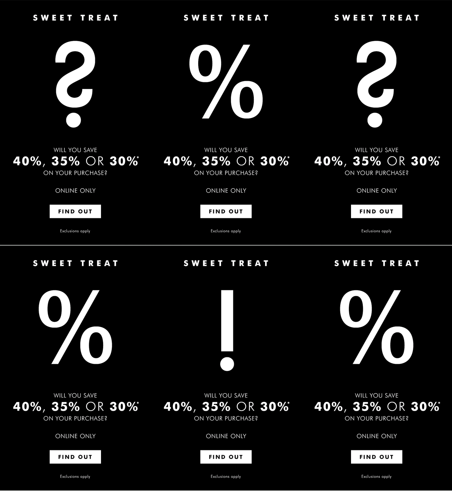
This means if image-viewing is turned off or the GIF is blocked or if it doesn’t load, the whole message is lost.
Let’s fix that.
Step #1: Isolate the animated GIF
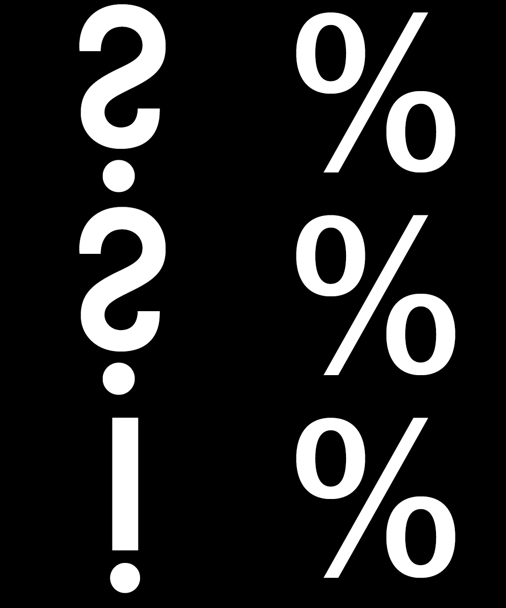
The animated GIF in this email is large. So even if it does show up in a reader’s inbox, it may not load all the way or at all, resulting in the email going unread. To avoid these issues, a best practice is to crop your animated GIF, trimming out the parts of the image that don’t need to be animated. In the Banana Republic email, that means we want to isolate the central part of the image that actually moves—in the pink box below—and recreate the rest with plain text and HTML.
To make a quick crop, we used ezGIF.com. Here’s our new animated GIF:
Step #2: Set up the email layout with content blocks
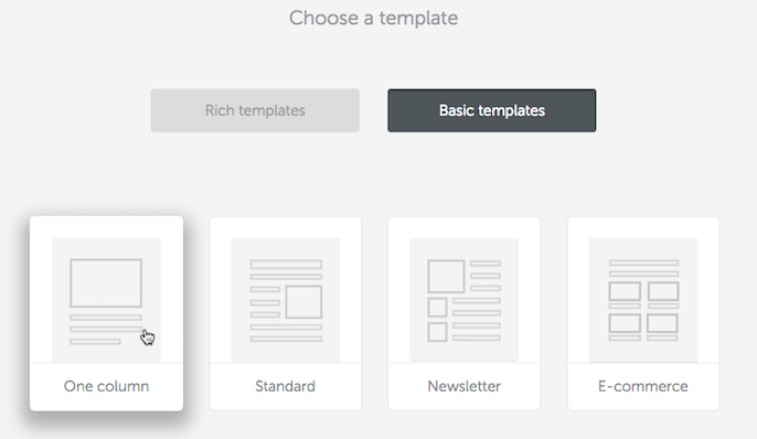
Today we’re starting with a basic one-column template in the BEE email editor.
The default structure of content blocks is very similar to what we need: text, followed by image, followed by more text, then a call-to-action button.
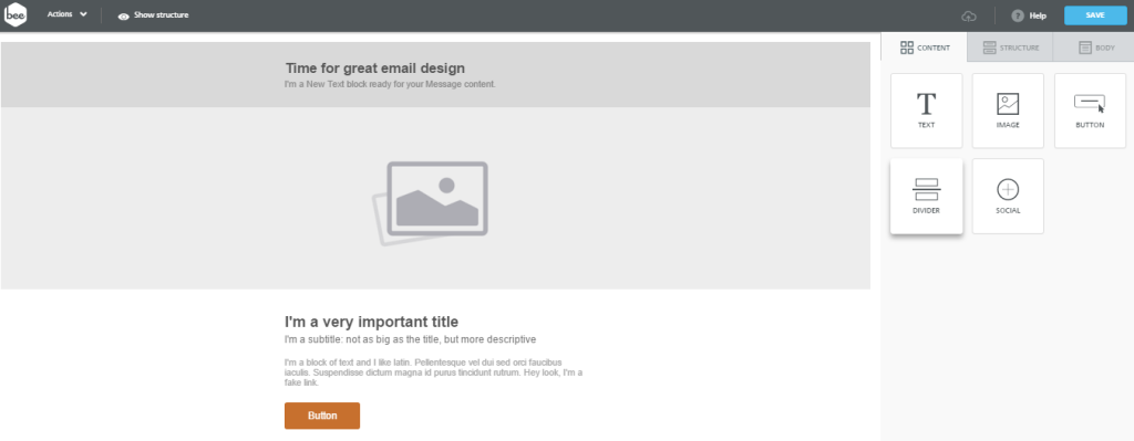
There’s no need to make any structure changes since the content blocks we need are already here, so I’ll get started by filling in the text, making sure to center-align everything as I go. I’ll also delete content blocks I don’t need, like the subtitle placeholder at the top.
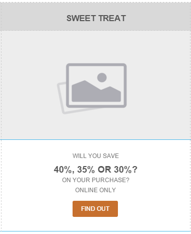
Then I can drag in my cropped animated GIF and drop it in the image placeholder, just as I would with a regular image.
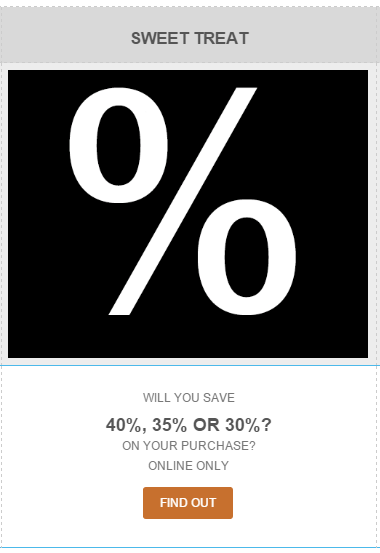
Now that our content is in place, we can begin formatting.
Step #3: Use HTML background colors
Starting with my “SWEET TREAT” content block, I’m going to set my font color to white and increase its size to 36px. Then I’ll go about making the background of the body of the email black, just like in the Banana Republic email GIF. To do this, I can simply adjust the background colors in the Row properties menu on the right, making the row background transparent and the content background black.

I’ll make the same Row properties adjustments for all of the following content blocks, including the background color behind my animated GIF.
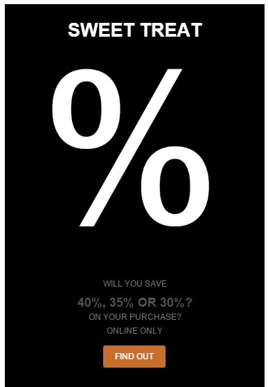
Now it looks like one, seamless block of color. I’ll finish by formatting the rest of the text.
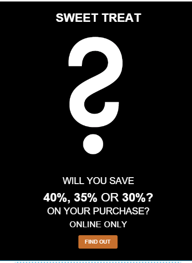
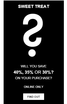
We need to make some final padding adjustments to space everything properly, and update our CTA button, but already our email looks almost identical to Banana Republic’s image—but we did it with email-safe fonts and HTML background colors. It’s amazing how polished our email looks, and we’ve significantly reduced our risk of the message being lost if the GIF doesn’t appear. The colors and text and, importantly, the call to action button will all still show up.
Step #4: Include a bulletproof call-to-action button
Spoiler alert: we don’t need to code a single line of HTML or do anything at all to make sure that our “FIND OUT” call-to-action button will work across email clients and devices. In the BEE editor, all buttons are pre-built to be bulletproof, meaning they are not image-based, so they will always show up, they will be responsive, and they’ll look great.
All we need to do is update the style in the Content Properties menu to the right. First, I’ll make the button background color white and change the font color to black.
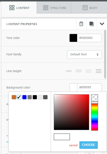
So the button looks like this:

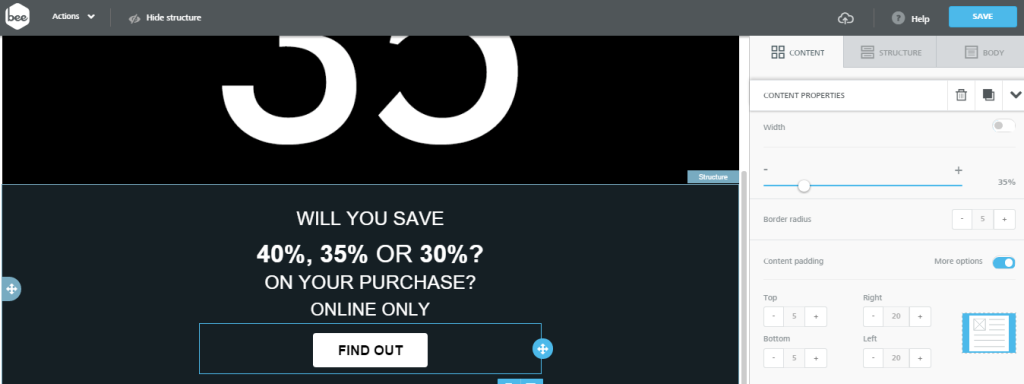
Then I’ll format the text, increasing the font size and making it bold. When I increase the size, the CTA appears on two lines. But back over in the Content Properties menu, we can increase the width to 35%:
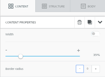
I notice Banana Republic’s button has sharp corners, so I want to make ours less rounded. To change the shape of the button, I’ll decrease the border radius to 0.
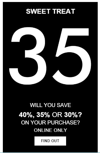
Here’s our email! We’re almost there.
Step #5: Final polish: adjust spacing
The text and CTA button at the bottom are too close. To create breathability, we can adjust the padding above and below each content structure.
Simply click on any structure (button, text, image), go to the Content Properties menu, and make sure More Options are viewable in the Padding section under Spacing:
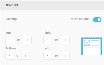
I adjusted the padding above and below the button, and above and below the “Online only” content block.
Here’s the final email:
And on our mobile preview, it looks great:
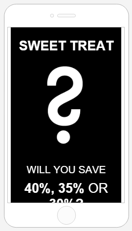
We’ve recreated the Banana Republic email almost exactly—with its slick, modern design and animated GIF—but we’ve optimized our use of HTML background colors and call-to-action buttons so our email is guaranteed to show up and look great across email clients and devices.
We hope you enjoyed this workshop about using gifs in email. Any questions? Let us know in the comments below. And be sure to try it out in the BEE email editor!