Valentine’s Day Emails: Design Tips We Love

Valentine’s Day is one big shopping event. According to the National Retail Federation, 2015’s online shoppers expected to spend an average $199 on Valentine’s Day gifts. Even if you’re not in the business of selling chocolate or roses, celebrating the holiday with a special promotion and email campaign is a wise move. Connect with readers through a sweet Valentine’s Day email and you can increase conversions and win hearts.
Check out our tips for best Valentine’s Day email design.

From developing integrations to strategic support, from creating creative concepts to optimizing results.
Sweeten up the subject line
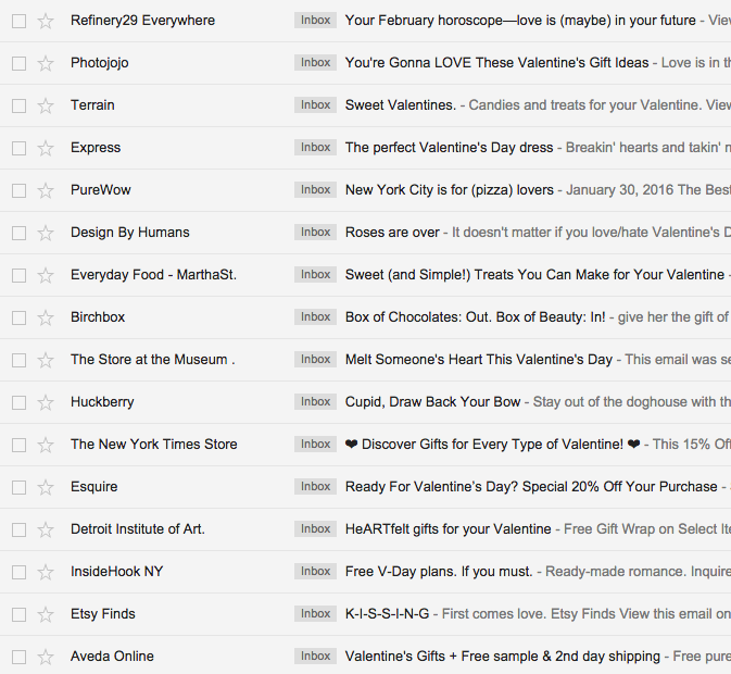
According to Email on Acid, Valentine’s Day email volume is second only to the Christmas holiday season. That means it’s time to put some extra TLC into a well-crafted subject line. High-performing V-Day subject lines have historically included gift and card ideas, personalized greetings, heart symbols, and the word “sweet.” Here are some fun ones from our inbox:
Don’t overdo it
V-day is a holiday where people tend to go to extremes to show their affection (does anyone really need a 195-piece box of chocolates?). But when it comes to showing your customers you care, don’t go overboard. Keep your Valentine email design consistent with your brand identity, like Paper Culture does with their simple background and fonts.

Here’s what we love about this design:
- The key message is incredibly short and focused, and it follows an inverted pyramid structure, beginning with a big 30% off headline, followed by a free shipping subheader, immediately followed by the CTA. It’s clear and concise!
- The key message claims most of the space in the email; follow-up content is smaller, deemphasized, and doesn’t keep you scrolling on and on.
- The story is super visual with images that are high quality, beautiful, and not over-the-top pink and red.
- There’s no distracting header, and the footer is simple and monochromatic.
However, the email doesn’t have a good balance of text and images; it’s too image-heavy.
Even the small descriptions underneath the photos are images instead of plain text, along with the full-width “50% off stationery” section. It’d be so simple to make these items plain text instead of images. That would decrease the risk of getting caught in a spam filter, reduce message size, and improve the look of the message for recipients with image-viewing turned off.
Artfully arrange your message
Chaos isn’t attractive. If you want to express your love this Valentine’s Day—and you have a lot to say—present your content with care. Always design on a grid (it’s easier to make responsive) and establish a consistent format in your layout.
Photojojo does just that. Each section of this sweet Valentine’s Day email is organized in the same way: header, two lines of intro text, followed by two images with captions and “Buy now” CTA buttons. The great layout and use of white space makes this email delightfully light and airy, even with a lot of content.

We admire this email’s:
- Streamlined, orderly layout that makes scanning easy
- Playful infusion of pink with the HTML background color, CTA buttons, and section headers
- Sweetly simple header and footer
- Beating heart animated GIF! (A simple GIF is less likely to devour readers’ mobile data)
But we’d make a few touch-ups by…
- Only using the Photojojo brand font in the headers (to decrease the number of images in the message and make it inbox friendly)
- Swapping out the image CTA buttons for bulletproof ones
- Optimizing for mobile with a responsive design. This one isn’t!
Send in-email sweets
Instead of asking subscribers to make a purchase, why not turn the tables and give them a gift? Not with a discount or promotion on your products, but with free, useful, Valentine’s Day content. It’s the perfect way to show the love and build brand loyalty. Take this email from Oh Joy, the design studio and shop:

This email design is sweet because:
- It offers readers interesting, authentic content in email (without asking them to click or buy anything!)
- High-quality images are broken up by short text blocks
- The header takes up very little space, so readers get right into the content
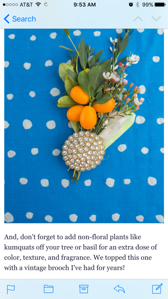
- It’s easy to read on mobile! Take a peek:
Lovingly design a header
So many promotional V-Day emails out there are comprised of a single image. But it’s a risky design move. A large image can increase your span score and be slow to load, or it may not appear at all depending on a reader’s email settings. Plus, single-image emails are nearly impossible to make responsive. The solution? Break up images and add text. Capitalize on flat design tactics and bold HTML background colors to create visual interest. We were inspired by Travel Zoo’s illustrated header—the style is super cute, it’s unique, and it doesn’t consume the entire email:
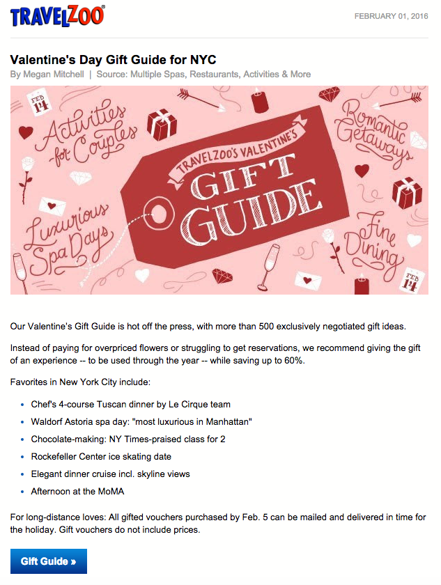
Here’s what we heart about this design:
- Perfect balance of images and email-safe text!
- The header is beautiful, one-of-a-kind, and garners attention
- Bulletproof HTML CTA button
Lead with something other than hearts
Chances are, your customers’ inboxes are already overflowing with cutesy images, hearts, and x’s and o’s. Choose a lead image for your email that’s different—that says Valentine’s Day with its allure and feeling of romance, rather than with cheesy or overplayed symbols.
We love how Rancho Bernardo Inn does it here. It seems like the perfect place to spend Valentine’s night. Plus, this is a great approach if you’re short on time or resources: say Happy Valentine’s Day in the text of your email; it doesn’t need to be all about pink photography and art.

What’s lovable about this design:
- There’s a healthy ratio of images to text
- Brand colors and fonts are retained, so the email looks distinctly Rancho Bernardo
- It’s easy to design on a limited timeline (use existing brand photos and communicate your V-Day message in text)
But we’d sweeten it up by…
- Making the CTA buttons bulletproof instead of images
- Simplifying the header and footer
- Cutting down on the secondary content text
- Streamlining the variation in font sizes and styles (bold, italics, all-caps, and varied tracking)
Valentine’s Day emails: wrap up
These days, we all celebrate Valentine’s Day in some way. Join the celebration and design a Valentine’s Day email that’s special and sweet!
- Put some TLC into a creative subject line. Inboxes are getting flooded. Stand out!
- Be short and sweet. Communicate your key message in a few lines of text. Try the inverted pyramid method.
- Design on a grid. Build a layout with a repeating pattern to create order with a lot of content and to make scanning easy.
- Offer added value content. Give a gift instead of asking readers to purchase one.
- Kick off your email with a V-Day header. Try an illustrated design or an animated GIF, and follow it up with plain text in order to create a good image-to-text ratio.
- Stay within your visual brand identity. Your email doesn’t have to be top-to-bottom pink and red. (Plus, if you’re in a time pinch, use existing visual assets and get festive with snappy text content or HTML background colors).
This post was originally posted on Email Design Workshop
